Watches - another OCD problem
-
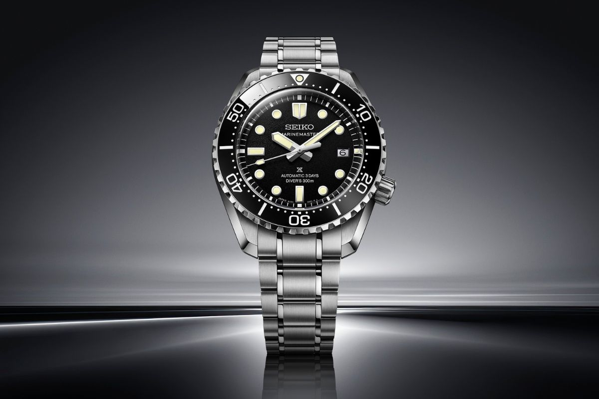
When did they decide to print "Marinemaster" on the dial again?
-
I miss the good old Seiko days when the SBDX001 was their aspirational diver and I could only afford a poor man's Marine Master Mod from Rob of Monsterwatches.nl
-
@Giles said in Watches - another OCD problem:
But love the "standard" version....
I saw this in Japan recently. It's definitely a step towards the real deal despite the twitter logo.
My prediction (with no knowledge) is that within one, at worst two years, they will remove the prospex logo. They are currently cutting their nose to spite their face and at some point management will stop this. This watch is an icon and having some numpty marketing on the face is a travesty.
Mind the price is now 35 to 40% more than the original, which is getting into Grand Seiko territory.
However, I would take this any day over a submawanker.
-
@Bridger said in Watches - another OCD problem:
However, I would take this any day over a submawanker.
QFT
-
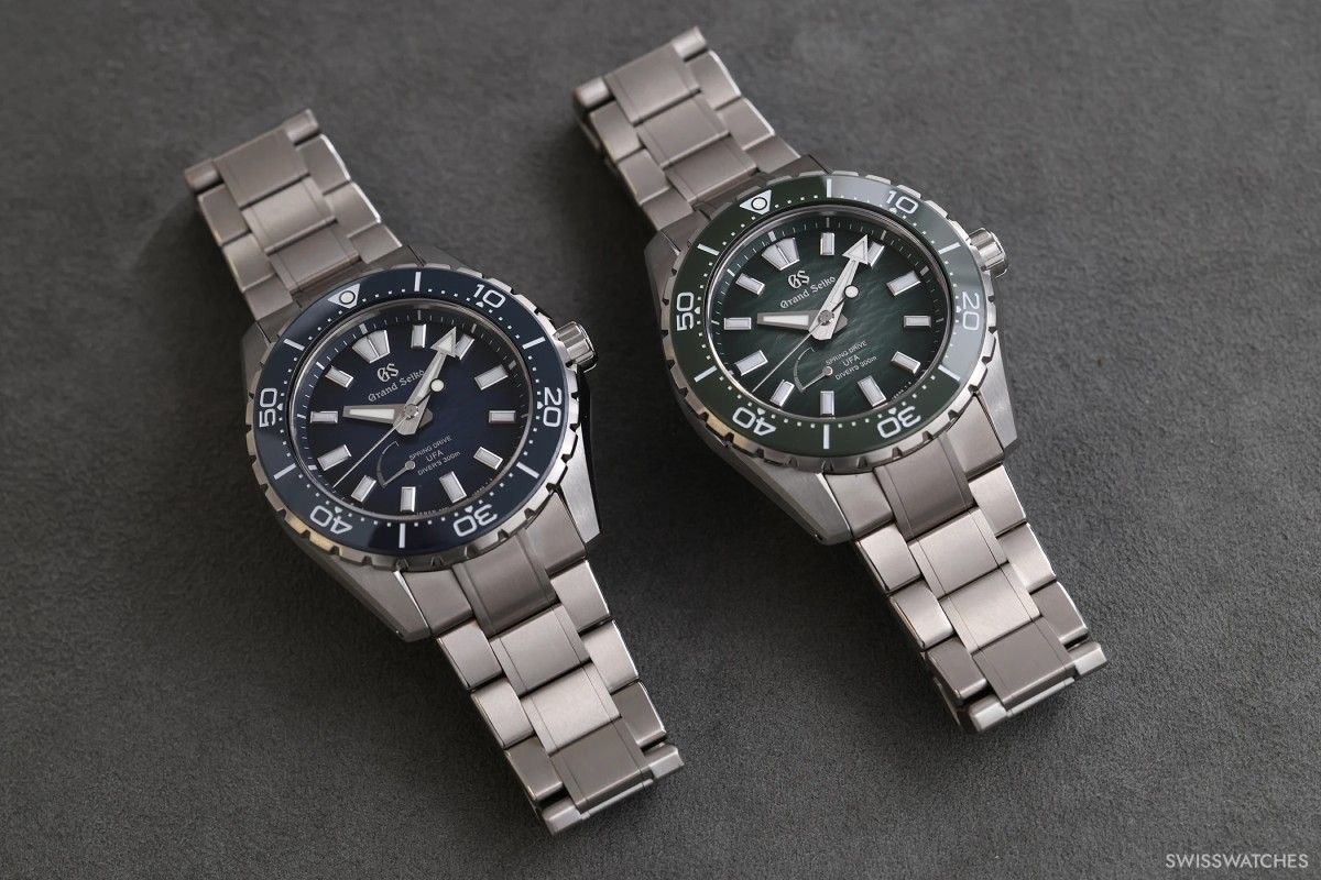
@Graeme Love textured dials, and this blue one looks like waves out in the ocean. I'd wear that in a heartbeat. I appreciate the subtle way it gets darker on the edges too. Attention to detail is great!
-
@Go-For-Chill the dial might look better in the metal than in photos too.
I still prefer the black textured dial to the blue and green though.
-
I think they’re great but a degrade dial can get old as a daily
-
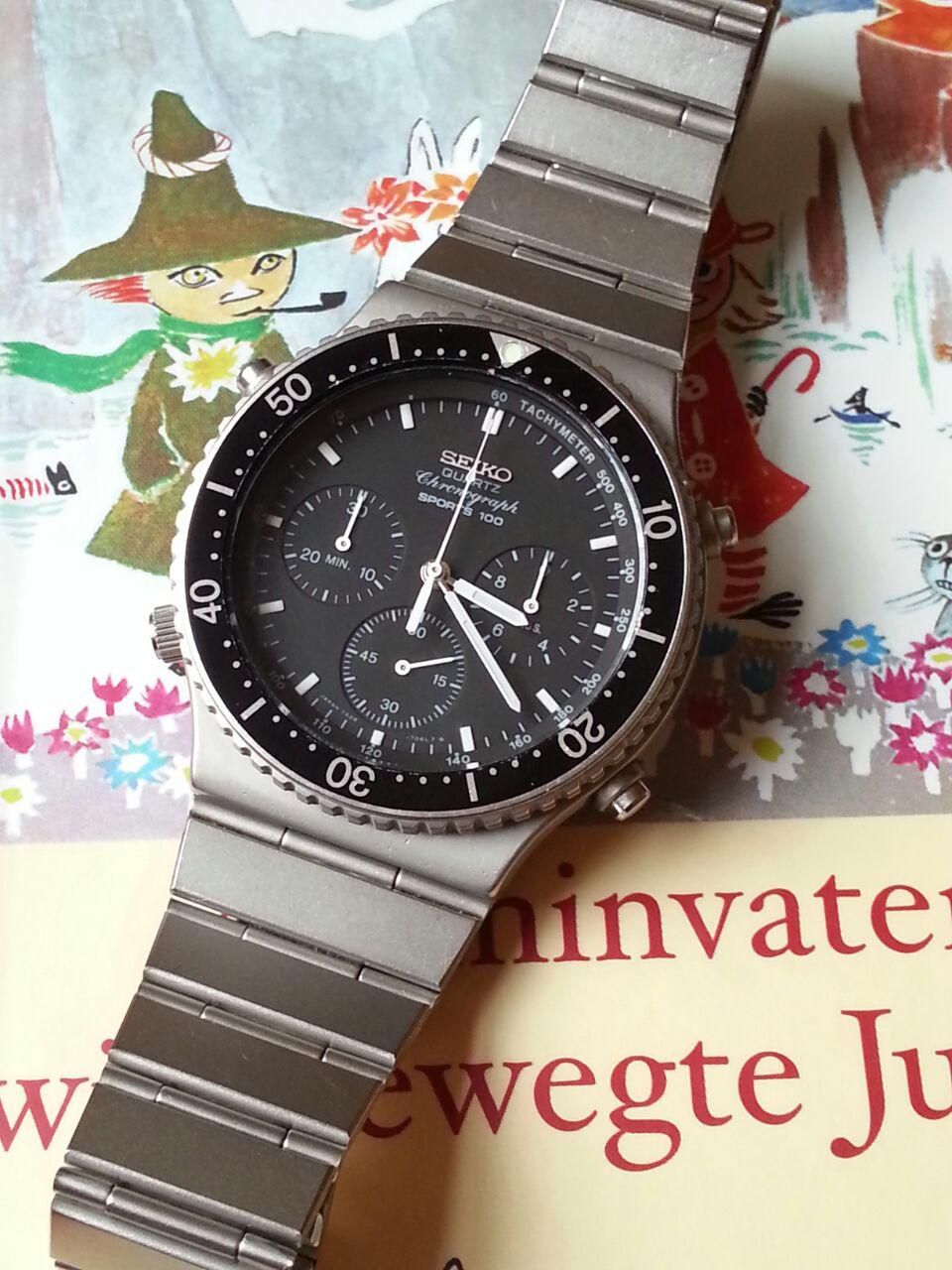
The world's first quartz chronograph if I'm not mistaken:
-
Finally hit it off with the manager at my local Rolex Boutique.

-
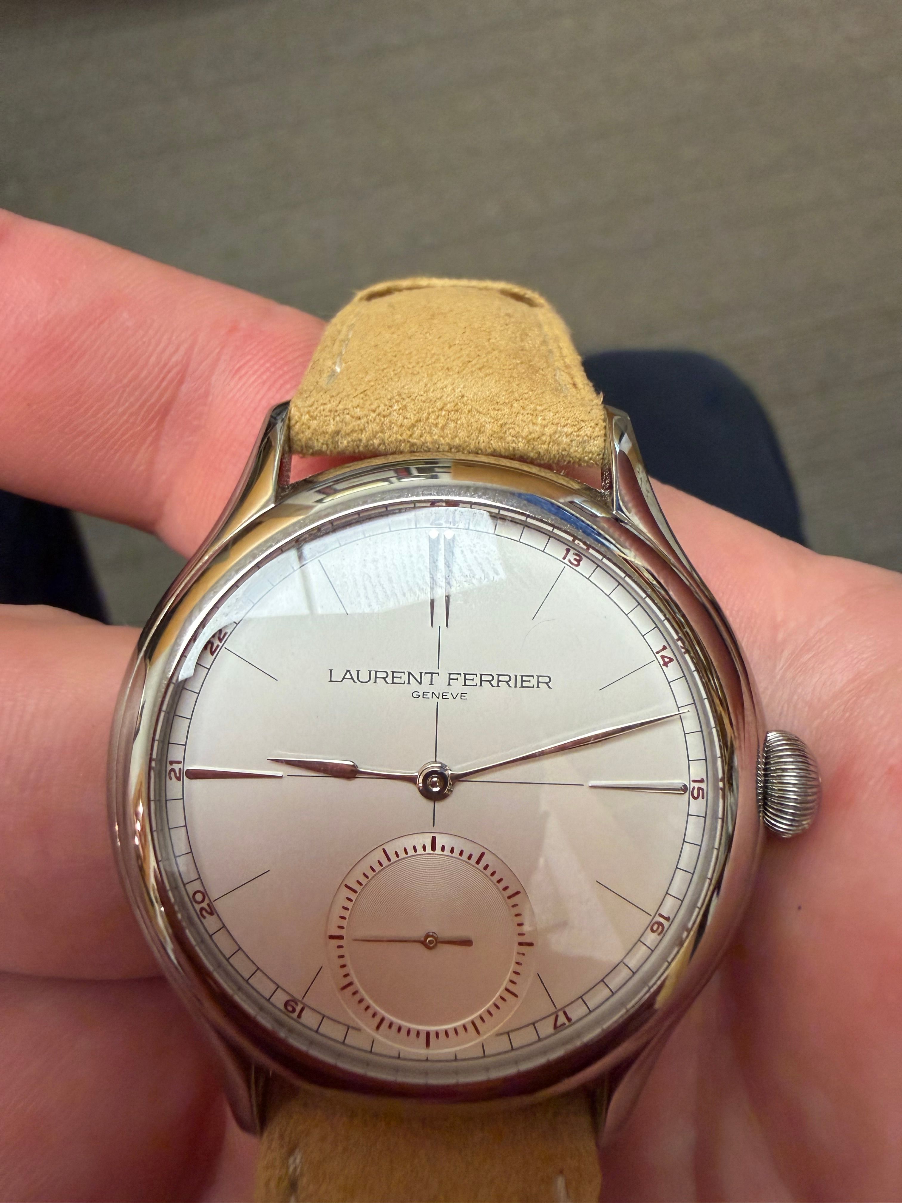
This one is cool. Very light not made of precious metals.

-
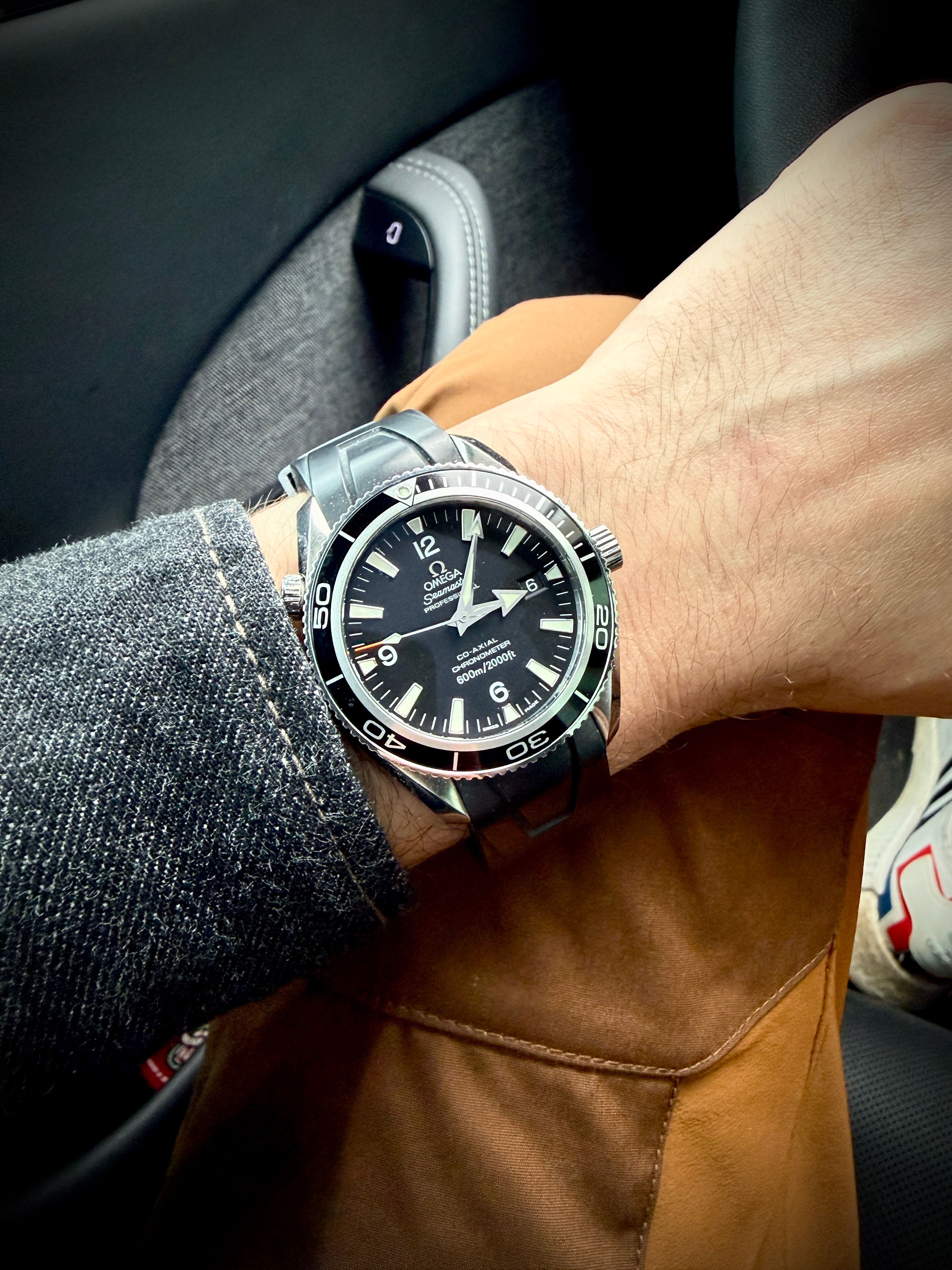
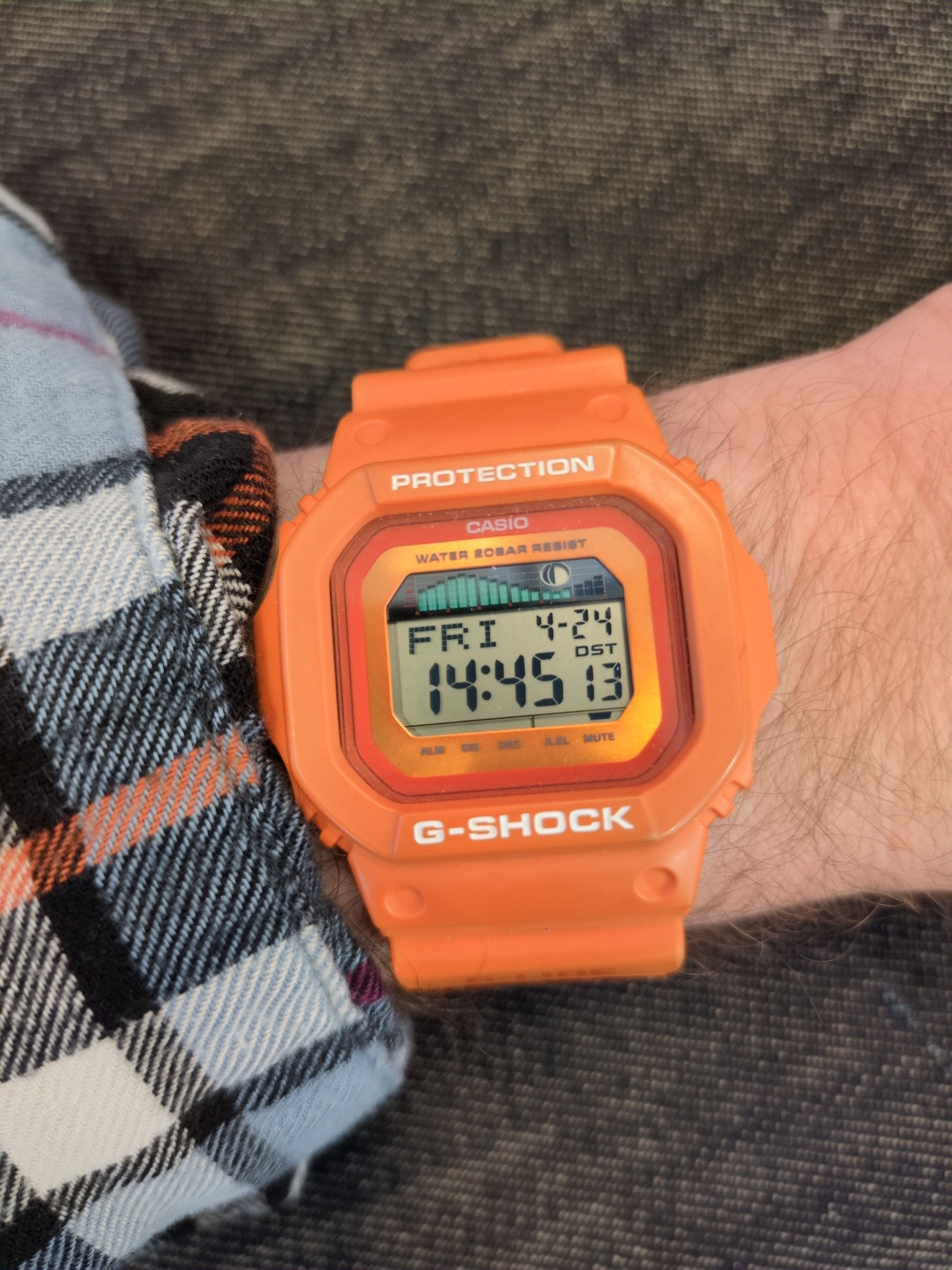
Pried my G-Shock off for this one today. -
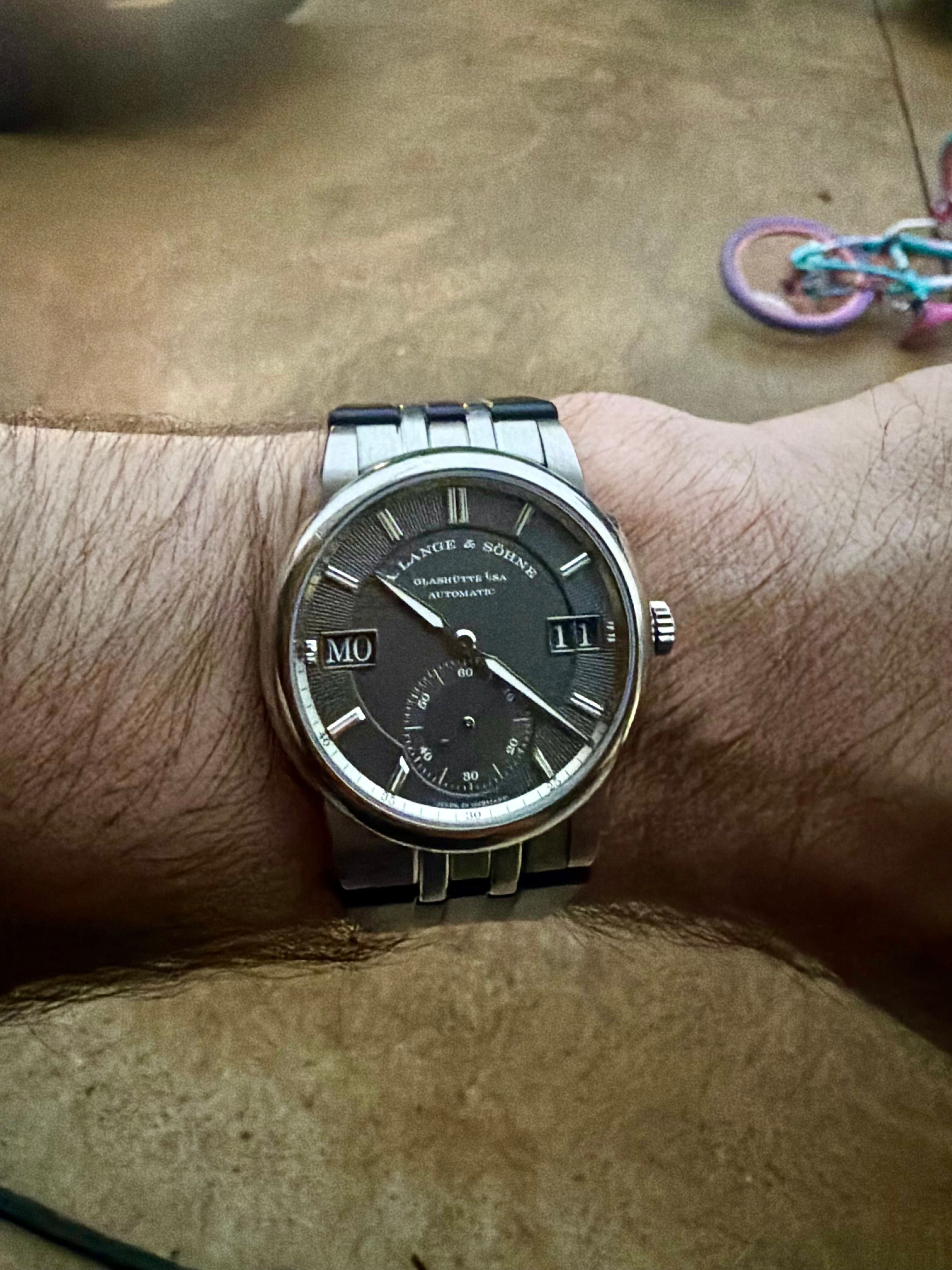
New Lange …. Holy $&@$. I talked myself into the idea that it’s a bargain compared the SS version
-
@goosehd said in Watches - another OCD problem:
@northsouthdenimguy …you’re wearing it wrong

Edit: I’m left handed and can not wear a watch on the right arm as it just feels wrong.
I'm a righty but have considered this just to keep the crown away from my hand, and piss off "real-watch-people".
-
@JDelage yea that one is definitly hot!!!
-

Back of the Lange