• Home
    • Recent
    • Calendar
    • Register
    • Login
    Iron Heart Forum
    Iron Heart Forum

    Iron Heart Fall/Winter 2025 Collection Preview - Now Live

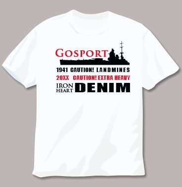
    Iron Heart Gosport Tee Shirt

    General Chat
    64
    222
    62.8k
    Loading More Posts
    • Oldest to Newest
    • Newest to Oldest
    • Most Votes
    Reply
    • Reply as topic
    Log in to reply
    This topic has been deleted. Only users with topic management privileges can see it.
    • ChrisC
      Chris
      Raw and Unwashed
      Joined:

      I like the potential in this one.  Good idea, Scroogen.

      Hmmm, maybe there could be some way to work in the Japanese rising sun image?

      last edited by 1 Reply Last reply Reply Quote 0
      • SimonS
        Simon
        Joined:

        Like it Scroogen, the one in Gosport is Green, but nice idea.

        Give me the luxuries of life and I will willingly do without the necessities - Frank Lloyd Wright

        last edited by 1 Reply Last reply Reply Quote 0
        • scroogenS
          scroogen
          Joined:

          I think a pocket tee with a union jack and rising sun flag on the pocket would be cool. Maybe something more subtle.

          last edited by 1 Reply Last reply Reply Quote 0
          • derivative666D
            derivative666
            Joined:

            What ever it is please let there be XXL

            "honorable mention to the bearded giant aka derivative666 for being a stand up dude & not changing with the seasons since i've been around these parts" Monday

            last edited by 1 Reply Last reply Reply Quote 0
            • M
              MikeC
              Banned
              Joined:

              Scroogen is right on with this one. I think the Japanese market would want too.

              last edited by 1 Reply Last reply Reply Quote 0
              • M
                MikeC
                Banned
                Joined:

                ^ I was referring to the lightship one.

                last edited by 1 Reply Last reply Reply Quote 0
                • Wavey_lenzW
                  Wavey_lenz
                  Banned
                  Joined:

                  I personally think it would be poor form to release a tee with any sort of rising sun image on it.

                  last edited by 1 Reply Last reply Reply Quote 0
                  • MattM
                    Matt
                    見習いボス
                    Joined:

                    Gosport

                    Little Town.  Big Jeans.

                    last edited by 1 Reply Last reply Reply Quote 0
                    • RocknRollR
                      RocknRoll
                      Joined:

                      Some great ideas. I think we could combine a couple of these concepts,

                      i.e. Redstripes idea:

                      and Scroogens idea:

                      I'd like a simple design, in keeping with the idea that "less is more".

                      Front: a little logo positioned like the forum t-shirts. Perhaps the IH motif with the letters GSC over it.

                      Back: a larger design with the silhouette of a large (perhaps military?) ship, with IRON HEART in large lettering along the side of the ship.

                      Keep it subtle - no direct mention of Gosport, but people in the know will  know what it's about.

                      RnR

                      PS: in case it's not obvious, GSC = Gosport Stubborn Crew

                      last edited by 1 Reply Last reply Reply Quote 0
                      • GilesG
                        Giles
                        IHUK Crew
                        Joined:

                        Nice.  I promise I'll get onto this soon…

                        "OK face up to it - you're useless but generally pretty honest and straightforward . . . it's a rare combination of qualities that I have come to admire in you" - Geo 2011

                        last edited by 1 Reply Last reply Reply Quote 0
                        • Finn666F
                          Finn666
                          Joined:

                          great one there RnR…

                          I'm still with my suggestion though (okay maybe the ship/your front print and/or other lettering on the back!)

                          @Finn666:

                          what about this…

                          clean and simple

                          last edited by 1 Reply Last reply Reply Quote 0
                          • RocknRollR
                            RocknRoll
                            Joined:

                            I like yours too, Finn.

                            Looking back, there have been a bunch of good ideas here, and the concept is great. We need to celebrate the quirkiness of the Gosport/IH connection without heaping shit on the place.

                            Whatever the decision, I'm always about simplicity - anything with a very busy design or trying to be too funny would totally put me off buying one.

                            last edited by 1 Reply Last reply Reply Quote 0
                            • Finn666F
                              Finn666
                              Joined:

                              I think G and H will do just fine 😉

                              btw. why don't we combine the Gosport T with this years forum hoodie theme?…wouldn't that be something? 🙂

                              last edited by 1 Reply Last reply Reply Quote 0
                              • J-IVJ
                                J-IV
                                啓蒙家
                                Joined:

                                @Finn666:

                                why don't we combine the Gosport T with this years forum hoodie theme?…wouldn't that be something? 🙂

                                Agreed

                                I'm as ugly as you

                                last edited by 1 Reply Last reply Reply Quote 0
                                • Madame ButtonflyM
                                  Madame Buttonfly
                                  IHUK Crew
                                  Joined:

                                  @RocknRoll:

                                  Back: a larger design with the silhouette of a large (perhaps military?) ship, with IRON HEART in large lettering along the side of the ship.

                                  “Shipping Beatch” lovin’ this idea  🙂

                                  AKA Mrs G

                                  last edited by 1 Reply Last reply Reply Quote 0
                                  • BeatleB
                                    Beatle
                                    Joined:

                                    We can do anything

                                    http://bybeatle.com

                                    last edited by 1 Reply Last reply Reply Quote 0
                                    • GilesG
                                      Giles
                                      IHUK Crew
                                      Joined:

                                      Brilliant…

                                      "OK face up to it - you're useless but generally pretty honest and straightforward . . . it's a rare combination of qualities that I have come to admire in you" - Geo 2011

                                      last edited by 1 Reply Last reply Reply Quote 0
                                      • J
                                        jacoavlu
                                        Joined:

                                        ok so now I guess we just talk about colors

                                        perfect beatle, just perfect

                                        last edited by 1 Reply Last reply Reply Quote 0
                                        • madmondayM
                                          madmonday
                                          Raw and Unwashed
                                          Joined:

                                          got to love beats,  change the 4 to a 21.  someone was mentioing 4 is bad luck & means death in some circles (if i recall correctly, if i'm wrong sorry in advance)  although a death biker is pretty bad a$$

                                          head high, middle finger higher

                                          last edited by 1 Reply Last reply Reply Quote 0
                                          • ChrisC
                                            Chris
                                            Raw and Unwashed
                                            Joined:

                                            Good call on changing the 4 to a 21, Monday.

                                            And is it just me, or does the rider look suspiciously like Nem?

                                            last edited by 1 Reply Last reply Reply Quote 0
                                            • First post
                                              Last post
                                            Copyright Iron Heart 2025.