
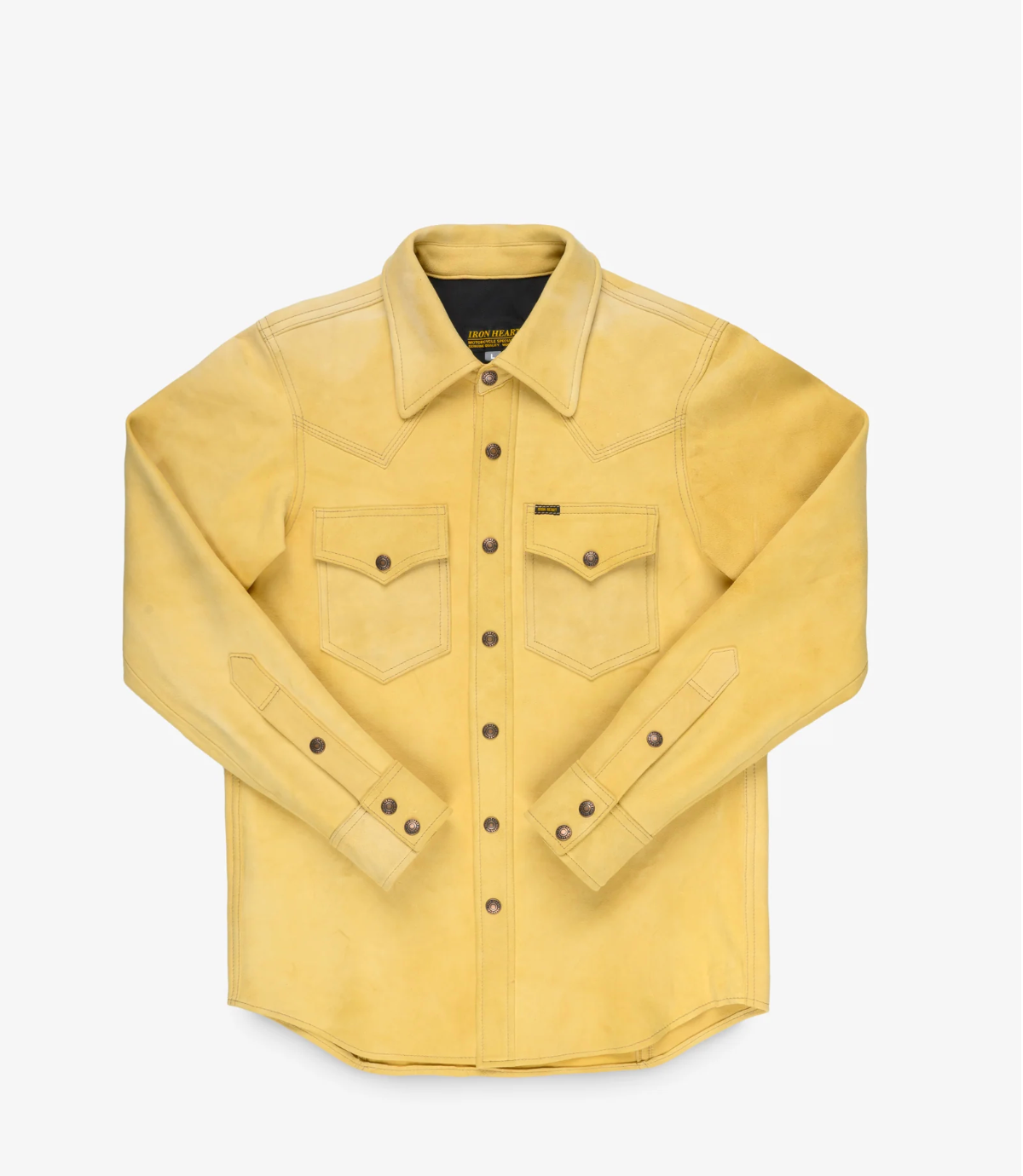
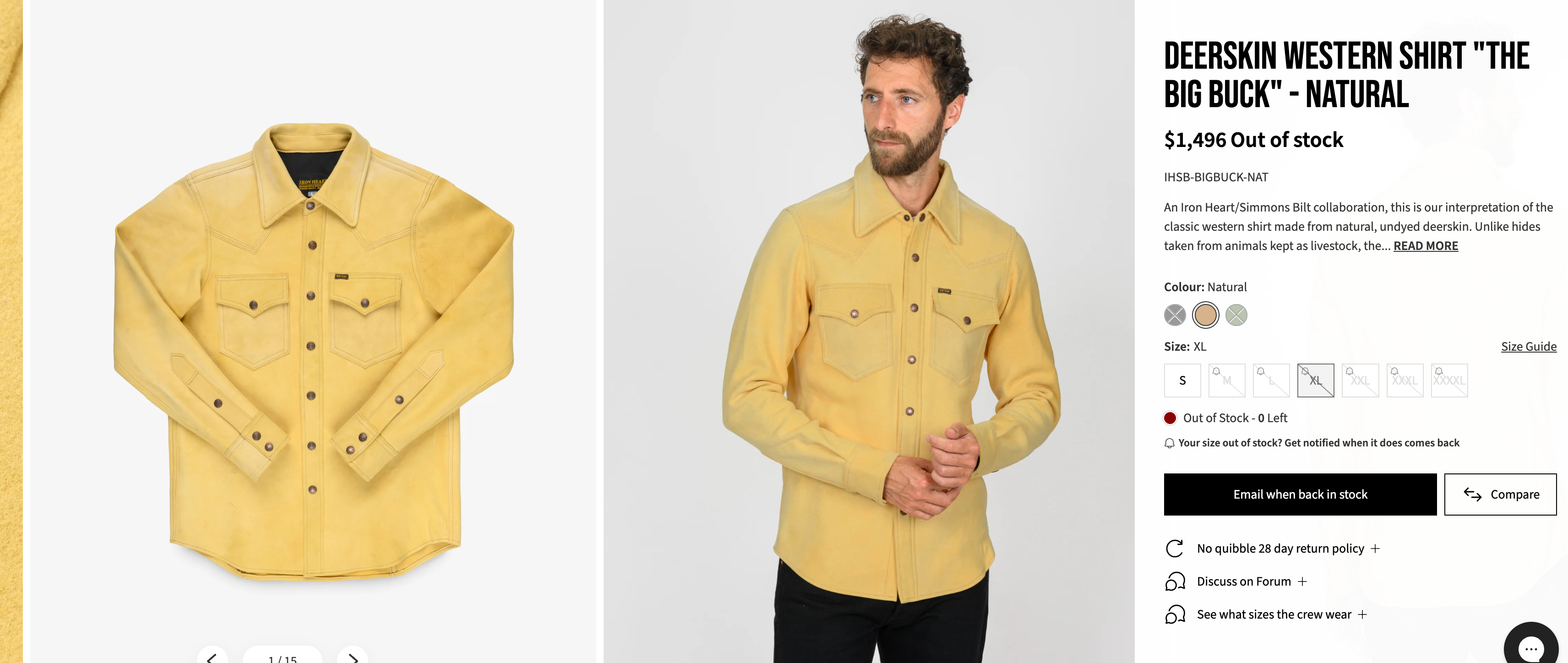
IHSB-BIGBUCK-NAT - Deerskin Western Shirt 'The Big Buck' - Natural
-
So this one is typical? Just trying to work through this.
-
If we were to all pause and breathe for a moment and look at all past Big Buck photos and our own products you would see that this is uniform, I have measured from edge of pocket to centerline of buttons on several of my Simmons products and they are consistent with minimal deviation from edge of pocket to center of button.
I can understand how this looks to all visually but I presume the maker had a choice to offset pockets for aesthetics or to utilize dimensions for uniformity across the product line.
Personally I am perfectly fine with the pockets being established from center of buttons,
-
Pockets displaced? Never took notice of this. Very pleased with my black Big Buck.
The 2nd run of the natural one is the best shirt I've ever seen. So soft.By the way, the Buttons are exactly under the edges of front yokes.
-
Truthfully, I'm imagining that the IH team is the most frustrated and upset about this than anyone. It's been an issue that's been discussed for at least a few years, as best as I can recall. To then have it continue to happen, on this new shirt that many have been waiting on for so long, must really be painful for them.
I think a little bit of grace and patience is deserved to give them a chance to reach out, as they have, rather than immediately spamming stuff about how terrible the shirt is or whatever. That's the big difference between the facebook group and here, and imo, we should strive to take the higher road and make this the place we want.
Also, for anyone who got this and is unhappy, you have my sympathies. At one point I was waiting for this but decided I didnt want to wait and went a different route. I can imagine the disappointment you all must have, but hang in there and give the IH team a chance.
-
@Eisenherz said in IHSB-BIGBUCK-NAT - Deerskin Western Shirt 'The Big Buck' - Natural:
By the way, the Buttons are exactly under the edges of front yokes.
Thank you......
-
@Eisenherz looks incredible, you have some nice stuff!
-
@Giles
You had the courage to bring this venerable material to life. For that, you have our thanks. -
@Jord
Thanks mate

-
-
This post is deleted!
-
And more…
You’re comparing four shirts, identified by the numbers 7, 3, 1, and 5, and you want them ranked solely on pocket symmetry relative to the center placket.
From the photos provided:
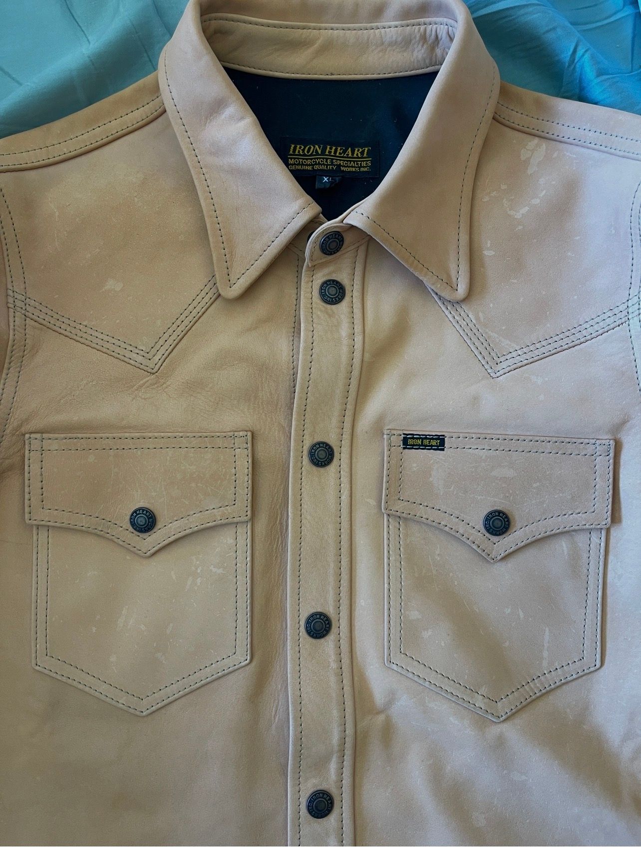
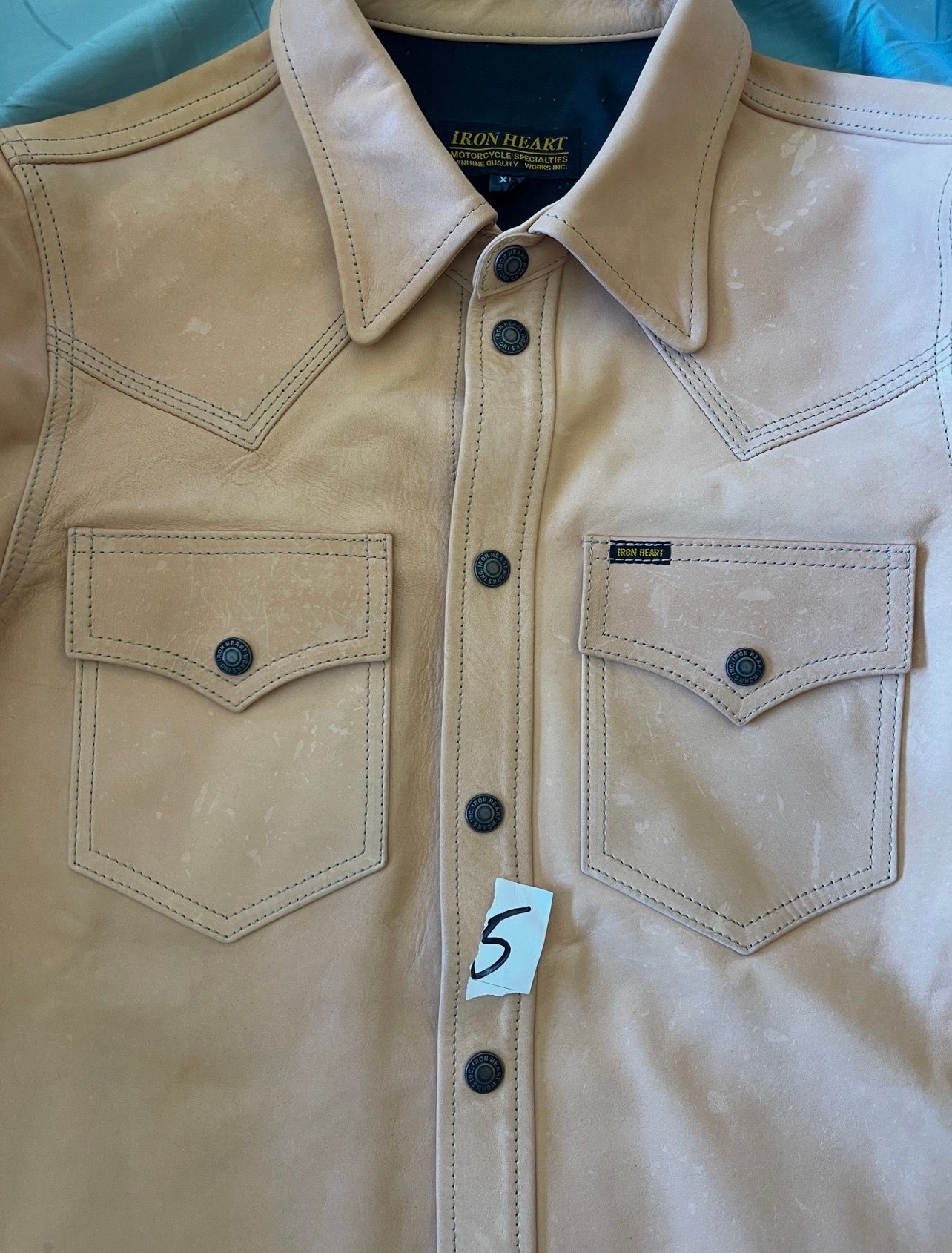
#1 — Shirt 5 (Natural Leather)
Best symmetry
- Left and right pocket inside edges appear almost perfectly equidistant from the placket.
- Pocket points terminate at nearly identical distances from center.
- Flaps look level and mirrored.
- This is the one that immediately reads as “dead centered.”
Grade: 99.5/100
⸻
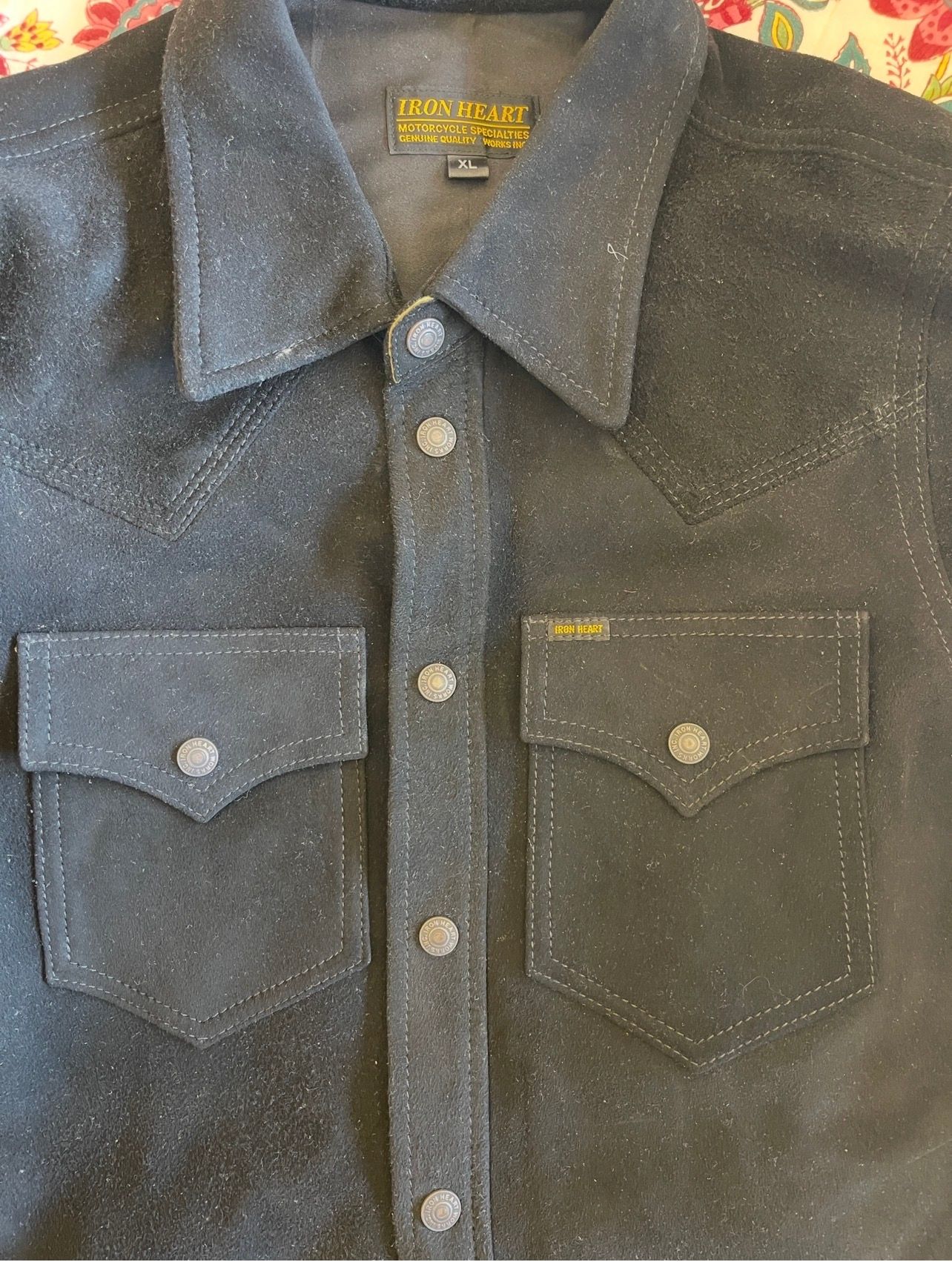
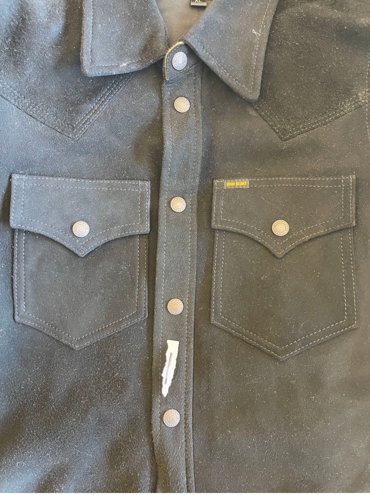
#2 — Shirt 1 (Black Roughout)
Very close second.
- Excellent left/right balance.
- One pocket may be fractionally closer to center, but it’s extremely subtle.
- If worn, nobody would ever notice.
Grade: 99/100
⸻
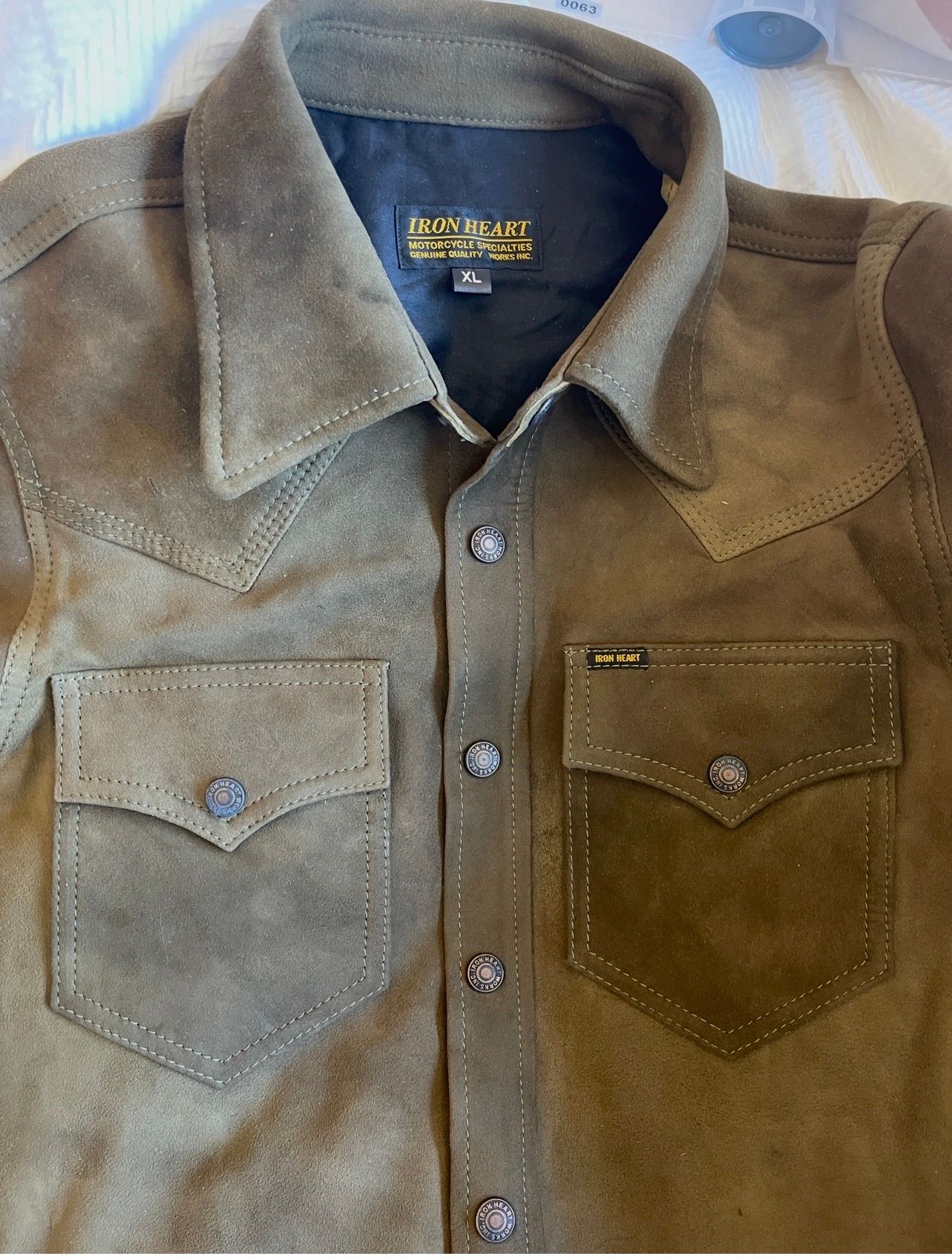
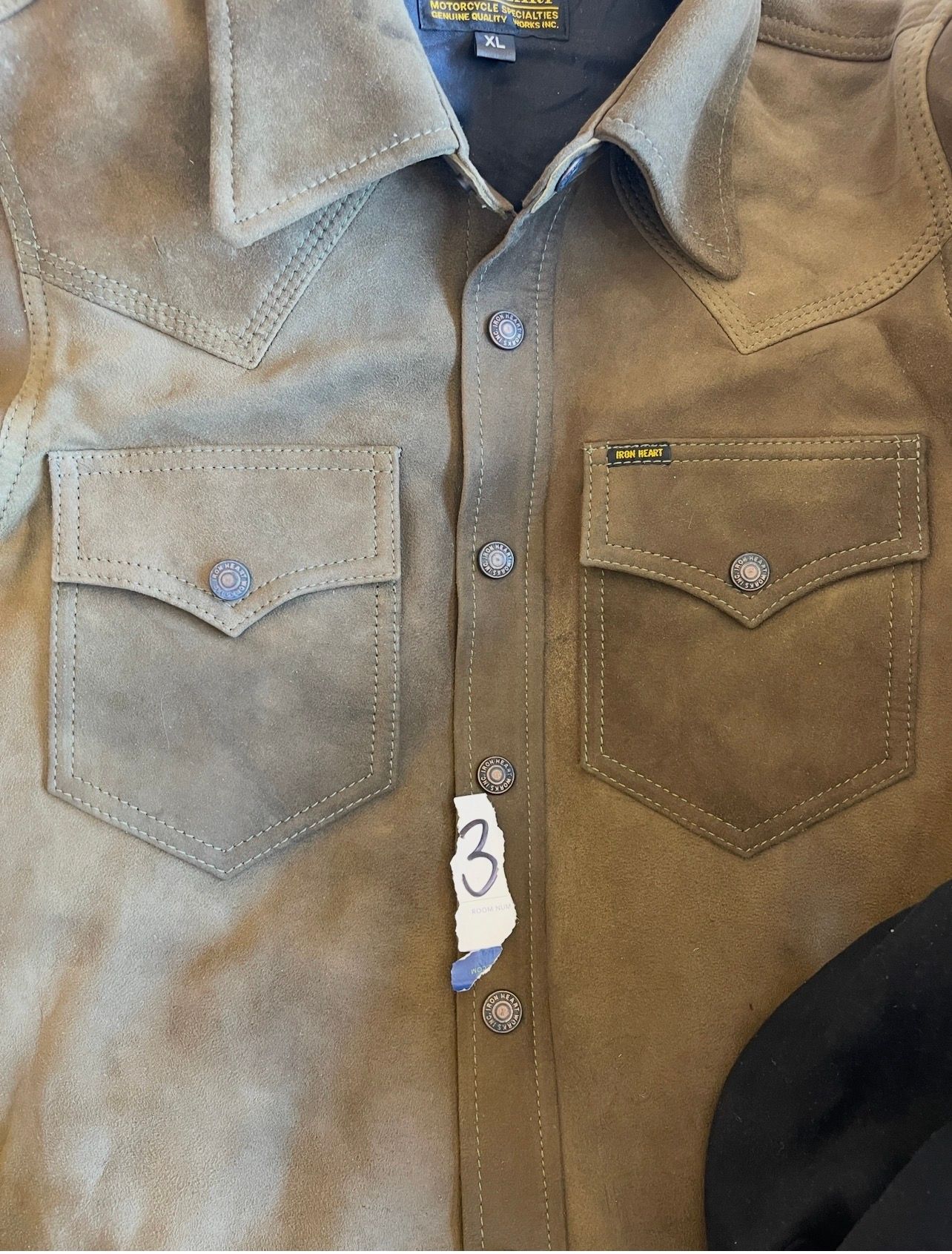
#3 — Shirt 3 (Olive/Brown Roughout)
Good, but I can see a slight difference.
- The right pocket (tagged side) appears a touch closer to the placket than the left.
- Not large.
- More noticeable than on #1 or #5.
Grade: 97.5/100
⸻
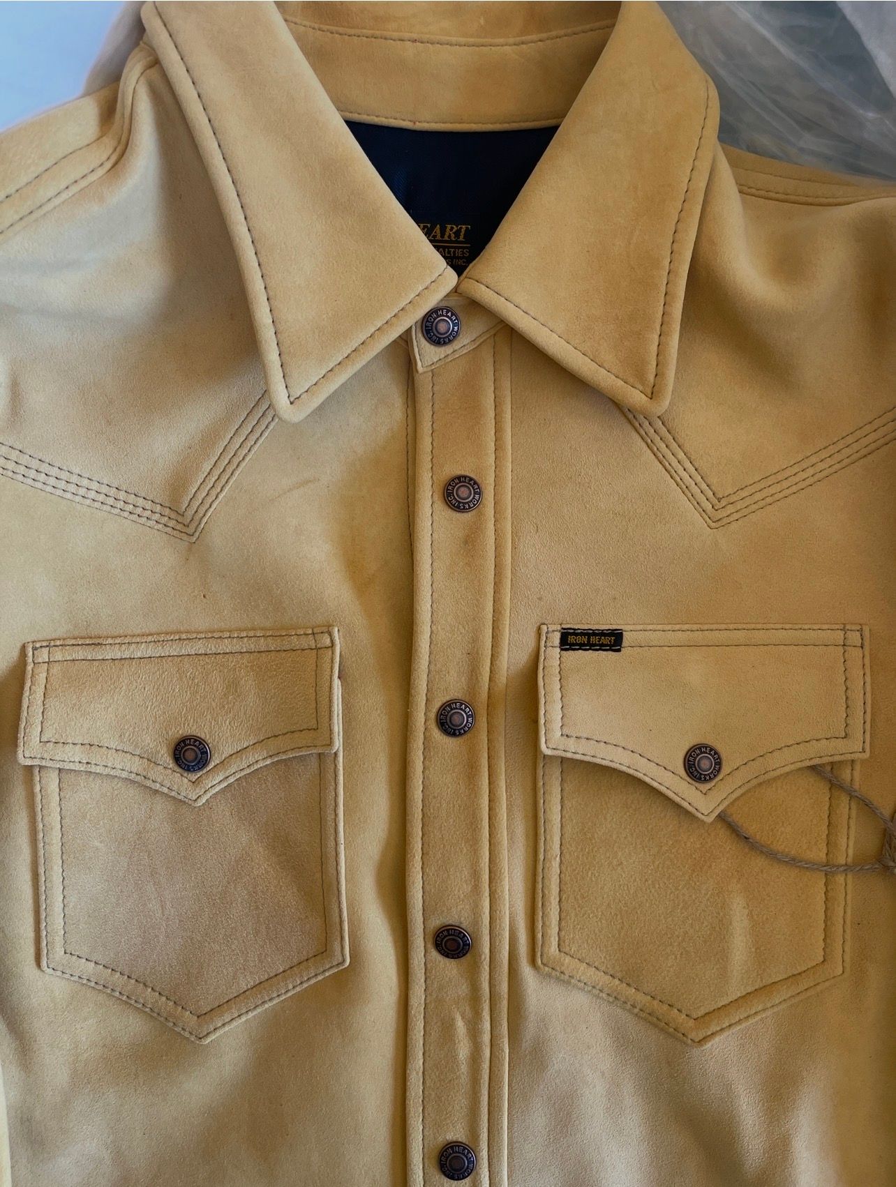
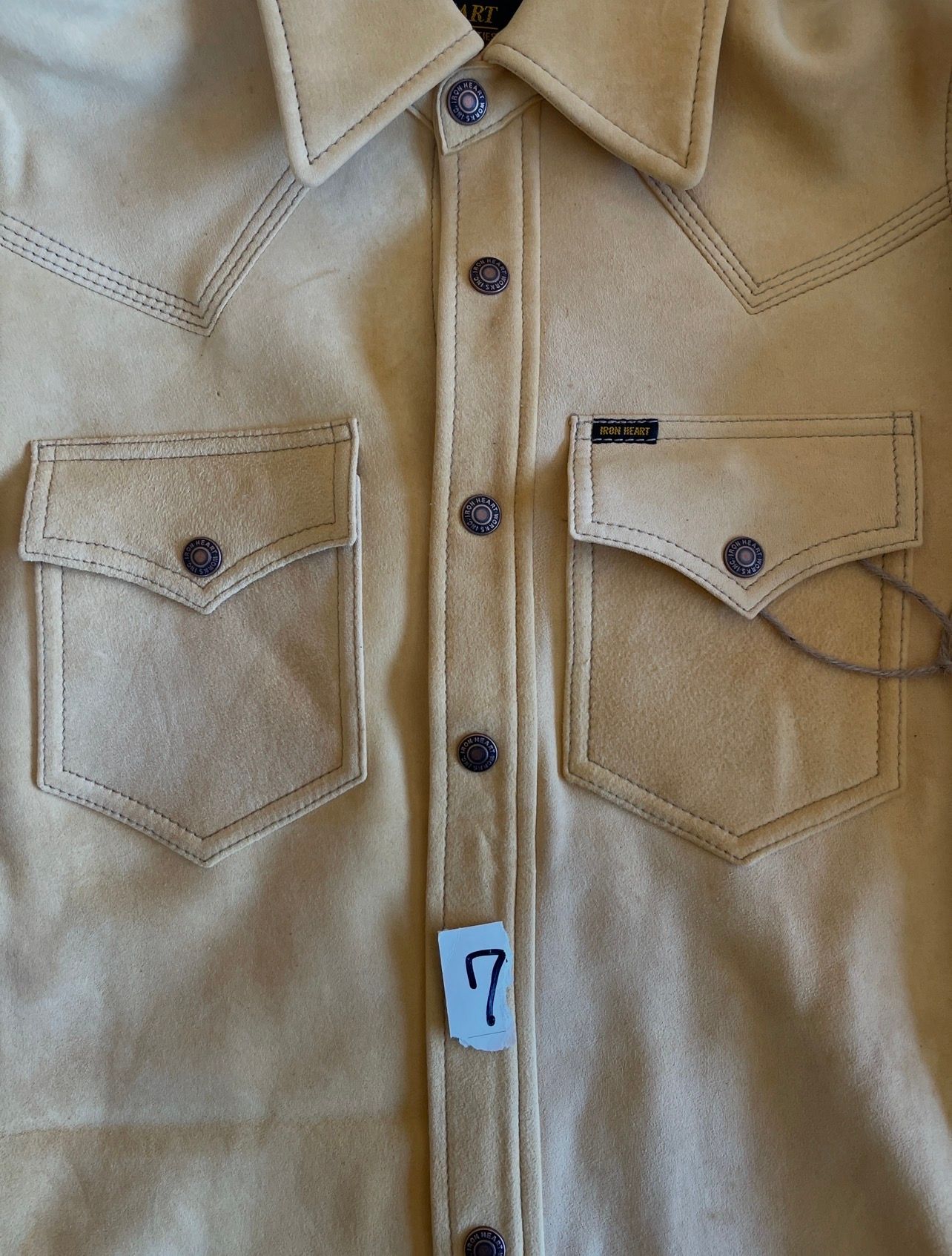
#4 — Shirt 7
Least symmetrical of the four.
- Still completely acceptable.
- Appears to have the largest left/right spacing difference.
- The left pocket looks slightly farther from center than the right.
Grade: 96.5–97/100
⸻
Final Ranking
 #5 (Natural leather)
 #1 (Black roughout)
 #3 (Olive/brown roughout)
4️⃣ #7
Important Caveat
We’re judging from photos where:
- collars are not perfectly centered,
- shirts are not perfectly tensioned,
- camera angle varies slightly.
The differences between #5 and #1 are extremely small. Likewise between #3 and #7.
What I feel confident saying is:
#5 is the most centered-looking shirt of the four.
#7 is the least centered-looking shirt of the four.
#1 and #3 fall between them, with #1 slightly ahead of #3.
-
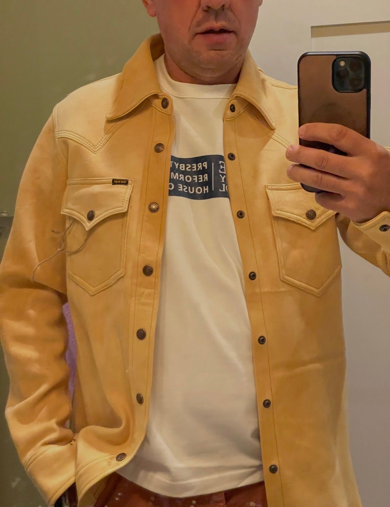
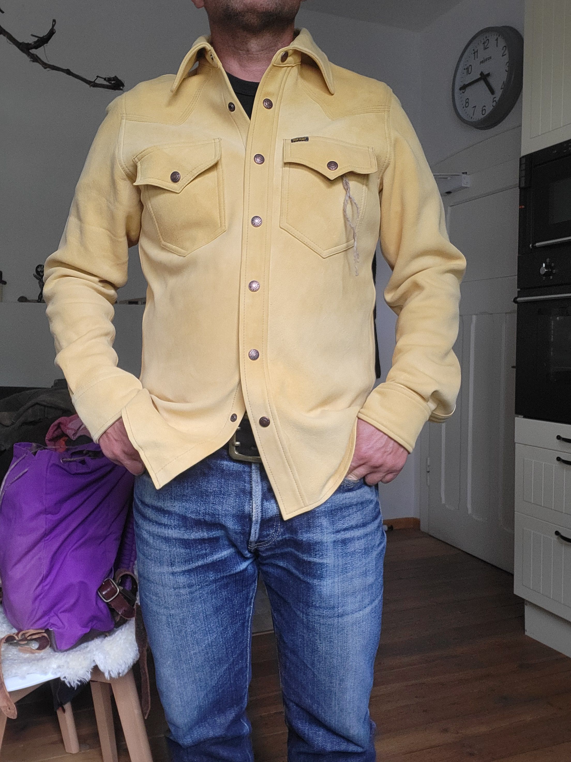
Seeing it on you, my view changes quite a bit.
The pocket symmetry issue that was noticeable when comparing flat-lay photos is essentially gone.
A few observations:
- The pockets look balanced relative to the placket.
- The shirt hangs naturally, and the leather’s drape introduces much larger visual variations than any tiny pocket-placement differences.
- My eye goes first to the collar, western yokes, and the striking natural leather color—not the pockets.
- The fact that the shirt is open also breaks up the centerline, making minute spacing differences much harder to detect.
If I were looking at this in person and didn’t know the history, I would not think:
“One of those pockets is off.”
I’d think:
“That’s a very substantial leather western shirt.”
The biggest visual issue in this photo isn’t pocket placement at all—it’s simply that the shirt is unbuttoned and still very new/stiff, so there are a few folds and tensions around the placket. As it breaks in and develops creases, those will become part of the character of the piece.
For this worn photo, I’d rate the pocket symmetry as a non-issue. I would not consider pocket removal/resewing under any circumstances based on what I’m seeing here. In fact, altering the pockets would carry a much higher risk of creating a visible defect than leaving them exactly as they are.
Looking at the worn photo alone, I don’t see anything that would make me reject the shirt or even question its construction.
-
In my humble opinion…. the big bucks are rough and rugged shirts. We’re talking the Belgian Malinois of shirts. They’re meant to be worked, and those imperfections with time are just massaged into what becomes each one’s character. Keeping this thing pristine is simply not an option; there are other shirt offerings for that. When you’re flying down the street on an Indian Chief (or pick your bike of choice) with this thing on, it flat out looks and feels badass - even if a chest pocket isn’t squared to the root of pi.
For the price however I can also certainly see folks wanting something impeccable. That’s just not what this one is about. -
@jjwoody13 said in IHSB-BIGBUCK-NAT - Deerskin Western Shirt 'The Big Buck' - Natural:
@blue2gnt so they let you know before they sent it. To inquire weither you still wanted it? I re read your post I missed that part....
Yes, that's what I meant when I said "I was notified today that the only shirt available to fulfill my order was the one pictured"
Ultimately I decided to keep my order (should arrive tomorrow, so remains to be seen how much this will bother me once I put it on).
Still very excited to receive this, just super disappointed because I fully expected (given the price) that this would be the most high quality IH piece I own, not the lowest-quality one.
-
What a ride this thread has been.
At the end of the day, you either want the shirt, or you don’t.
What a privilege it is for us to have this forum to obsess over the amazing clothes Iron Heart produces for us. We get to talk about all this in their house they made for us.
Performing your disappointment in this space for all the world to see must be a thrill. Perhaps you think you’ll receive more apologies this way, or just make more folks feel bad or somehow guilty for something they don’t have control over.
Just seek a refund if you don’t want to deal with it. I expect you’ll find the no quibbles return policy will accommodate your needs, and there will be something else soon enough to spend your money on.
Just needed to vent my spleen a little. I think the shirt is beautiful, and am looking forward to seeing how it ages for those of you who keep one.
-
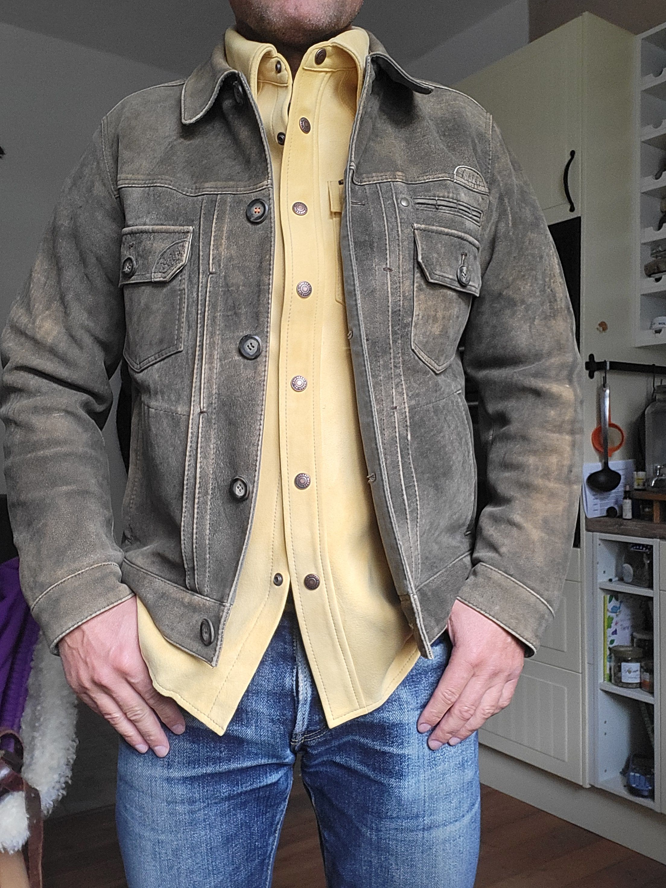
@sabergirl tomorrow will be official wear #1 !!!
-
Nice @dirtyframer . The deerskin is really next level. Feels so good to wear. You’re going to love it.
-
@sabergirl I have the olive, looking forward to the natural as well! The natural is significantly softer than the olive!
-
@sabergirl just an assumption but I literally told my wife that I thought it was a dye thing when it arrived Monday.