Iron Heart UK V3 - The New Web Site
-
Enthusiastic +1
-
Ditto, thought my iPhone was acting crazy at first but really like it shoque
-
true that, great work shoque!
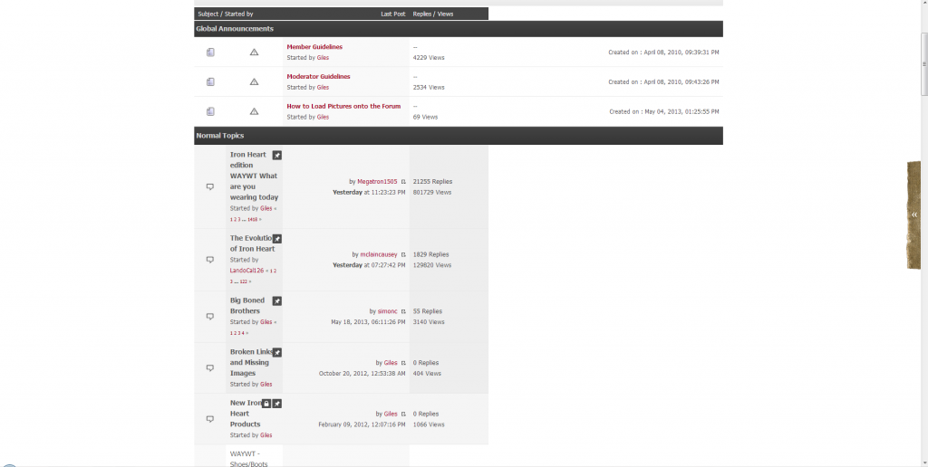
the only thing i find is that there might be a bit too much red text when checking the "unread" or "replies" for new posts etc. …maybe it would look a tad better if the "name of the thread creator" as well as "the forum section where the thread has been posted" would be black, no?
so that just the actual thread title would be red...should be a bit better for the general viewing pleasur imo!
-
true that, great work shoque!
the only thing i find is that there might be a bit too much red text when checking the "unread" or "replies" for new posts etc. …maybe it would look a tad better if the "name of the thread creator" as well as "the forum section where the thread has been posted" would be black, no?
so that just the actual thread title would be red...should be a bit better for the general viewing pleasur imo!
You are right, I will modify to look like the regular topic list.
like it a lot very clean.
Constructive criticism from a designer with over 20 years experience - the red bits in the ironheart logo don't pop/show enough from the denim background
Done, vanOlzon told me the exact same thing.


")


")