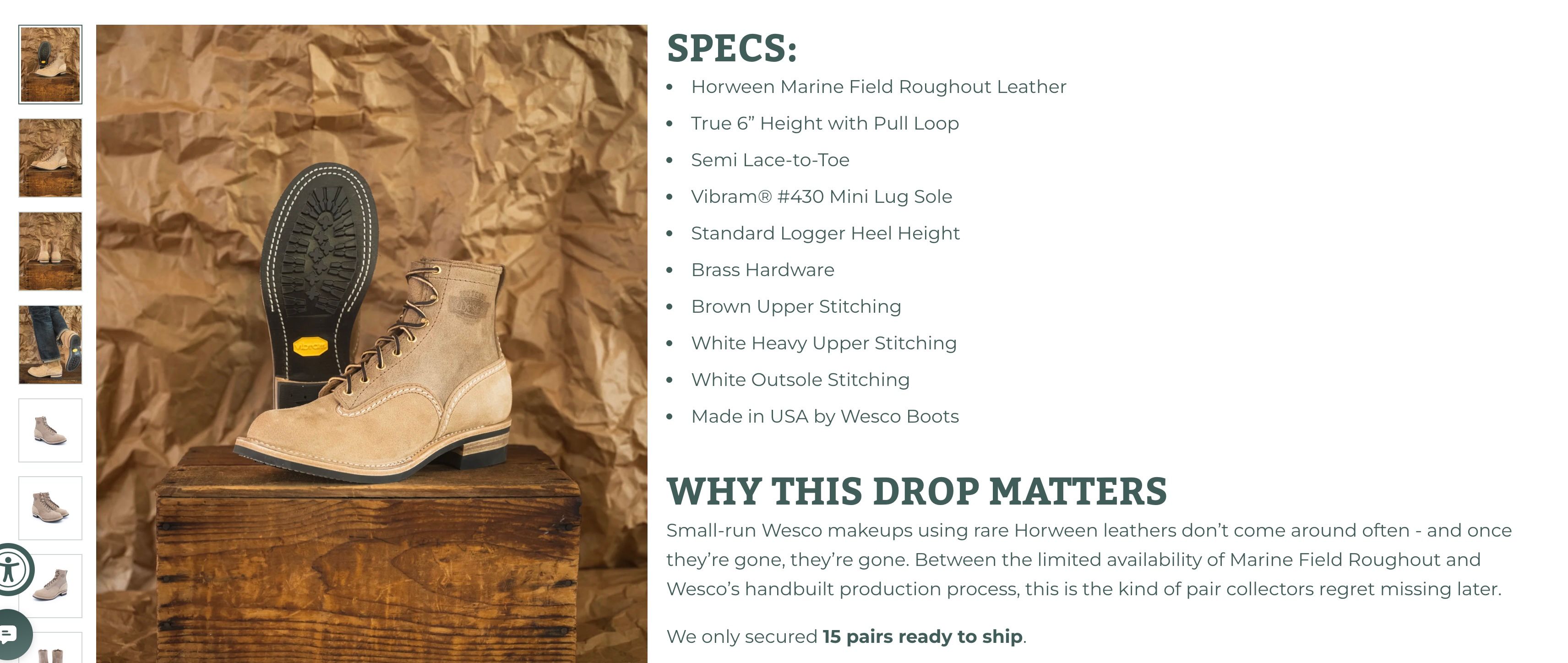
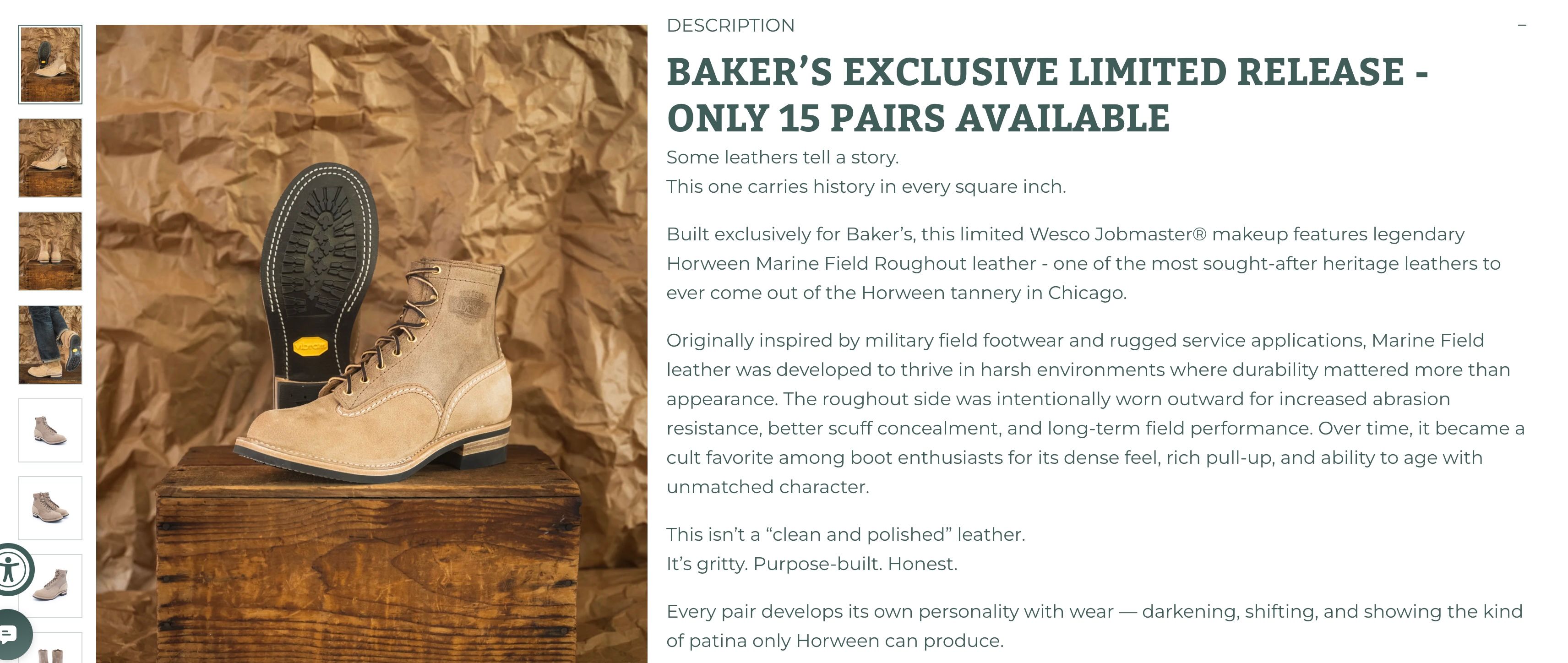
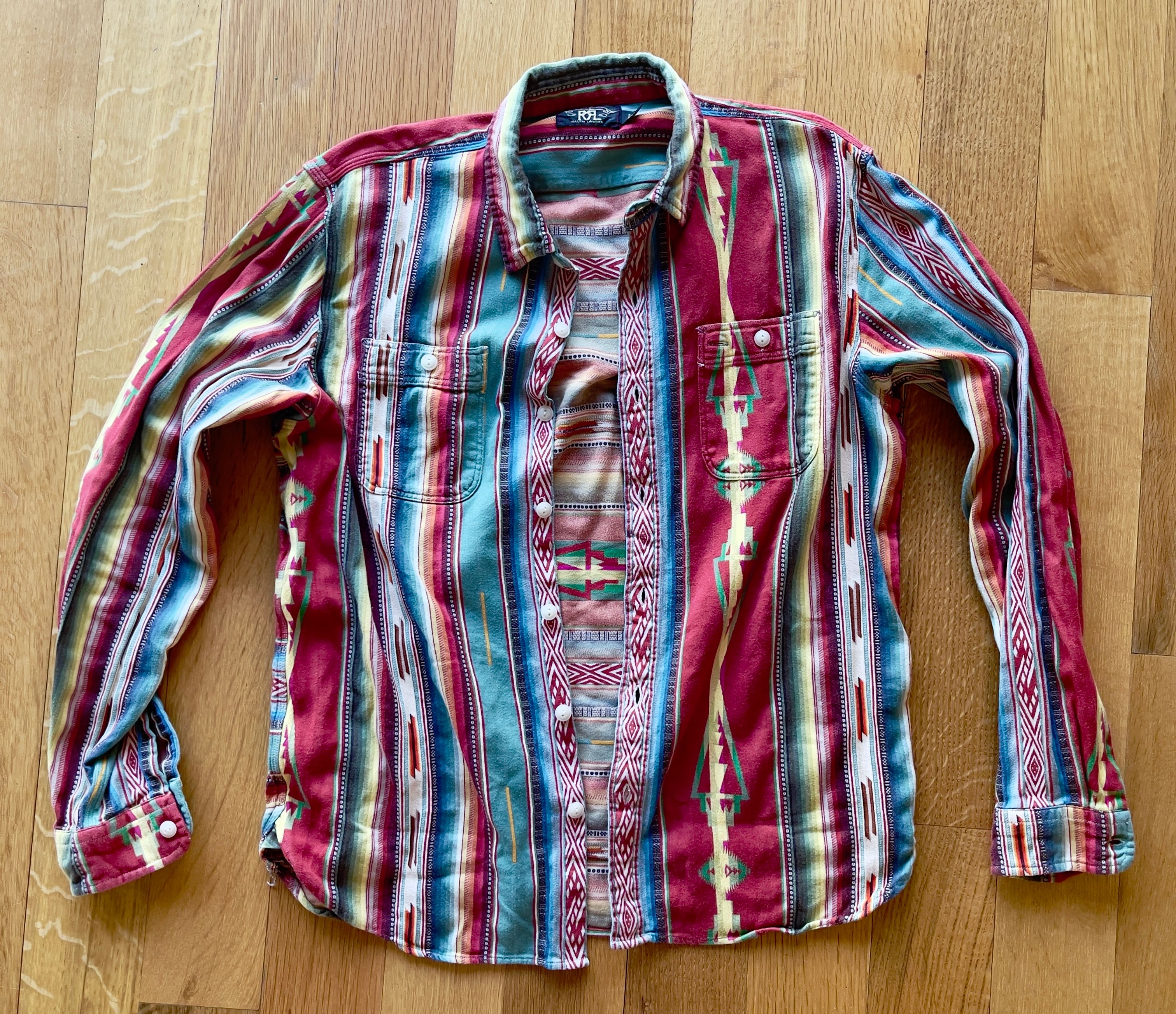
Matching glory…
Posts made by indigostiff
-
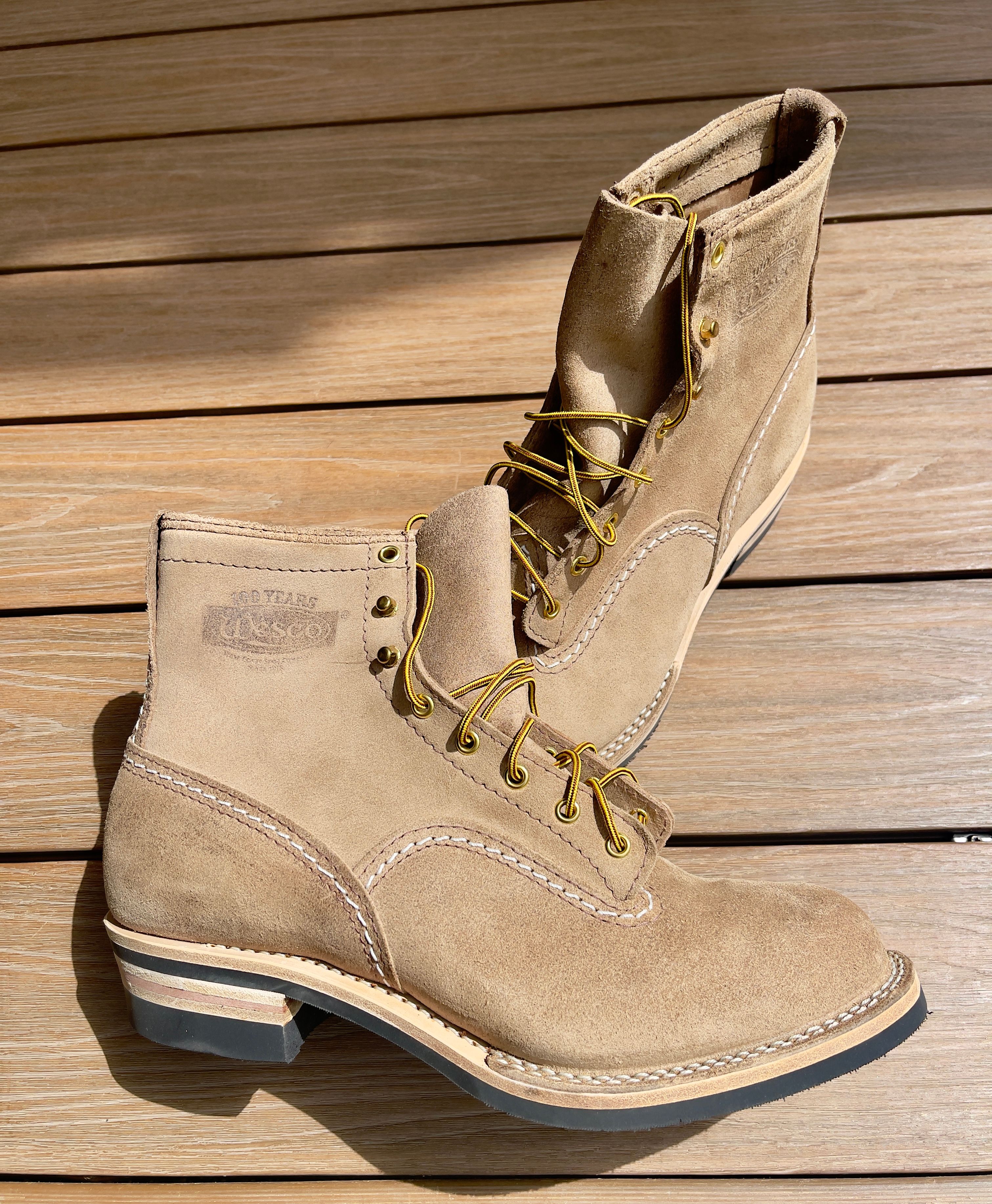
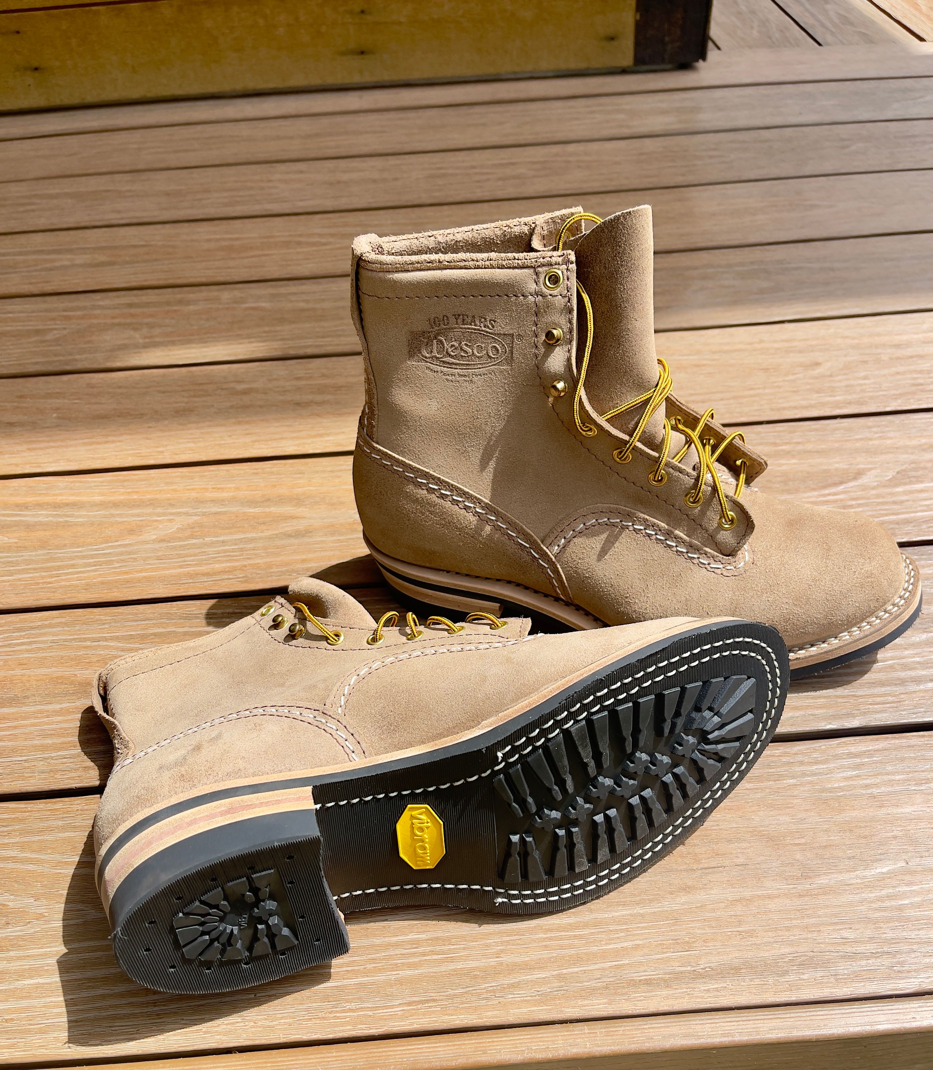
RE: WESCOposted in Footwear
@Setanta I have them on order... forever, it seems. Do they run narrow? IE, should i get an E width or stick with a D? I prefer the Es on my Mr. Lous, but usually am a D.
-
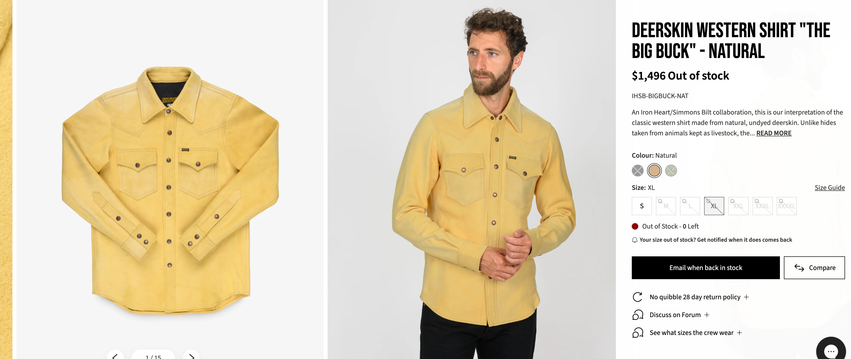
RE: IHSB-BIGBUCK-NAT - Deerskin Western Shirt 'The Big Buck' - Naturalposted in Shirting
Coming out was tonight! Random church ladies told me how beautiful she was!
-
RE: IHSB-BIGBUCK-NAT - Deerskin Western Shirt 'The Big Buck' - Naturalposted in Shirting
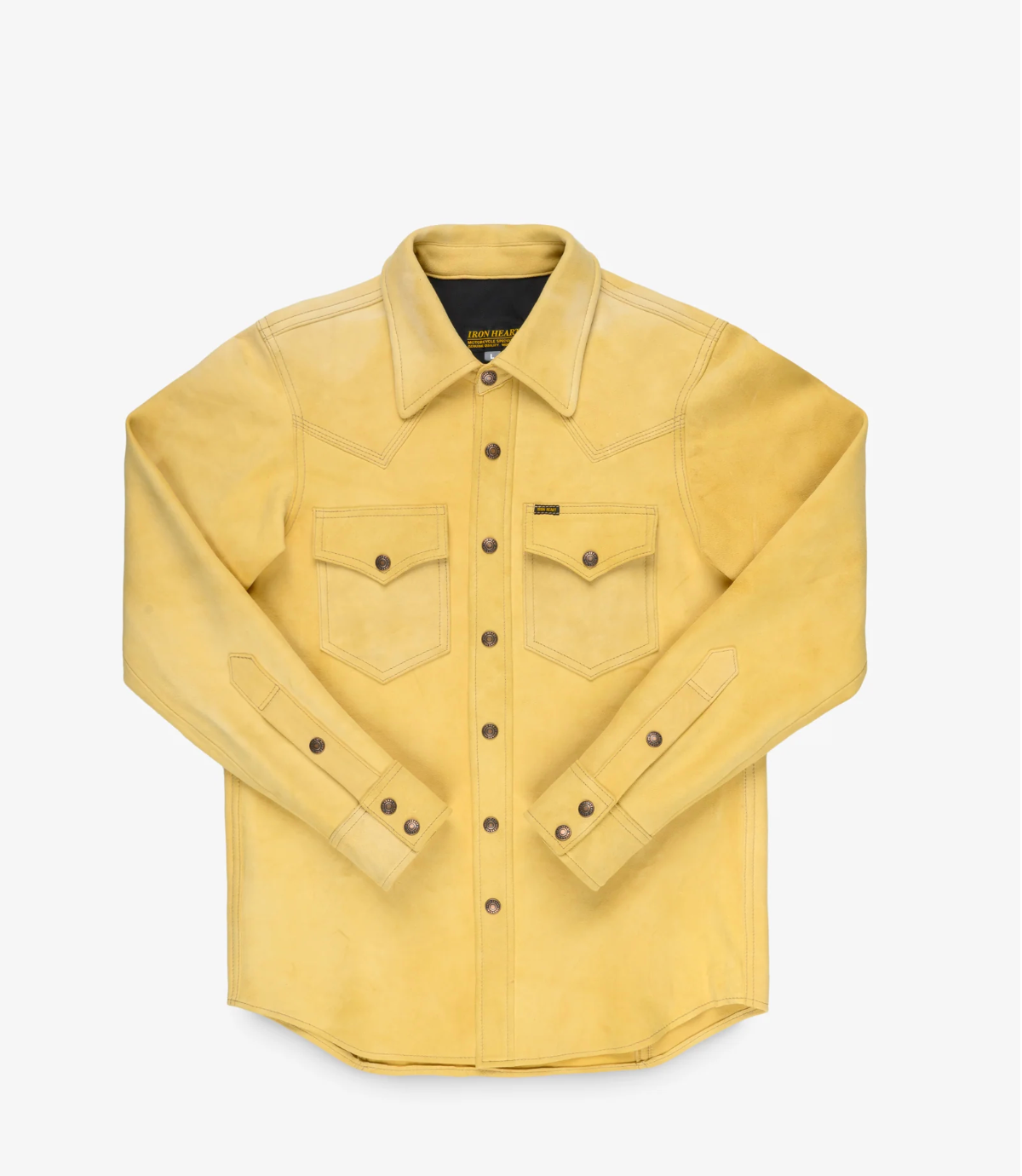
@sabergirl All of them start out as natural, from what I understand, and are then paint-dyed their respective olive or black colors, thus affecting the hand of the original hide, sort of like a coating of paint on a surface - it just changes it and somewhat stiffens it.
-
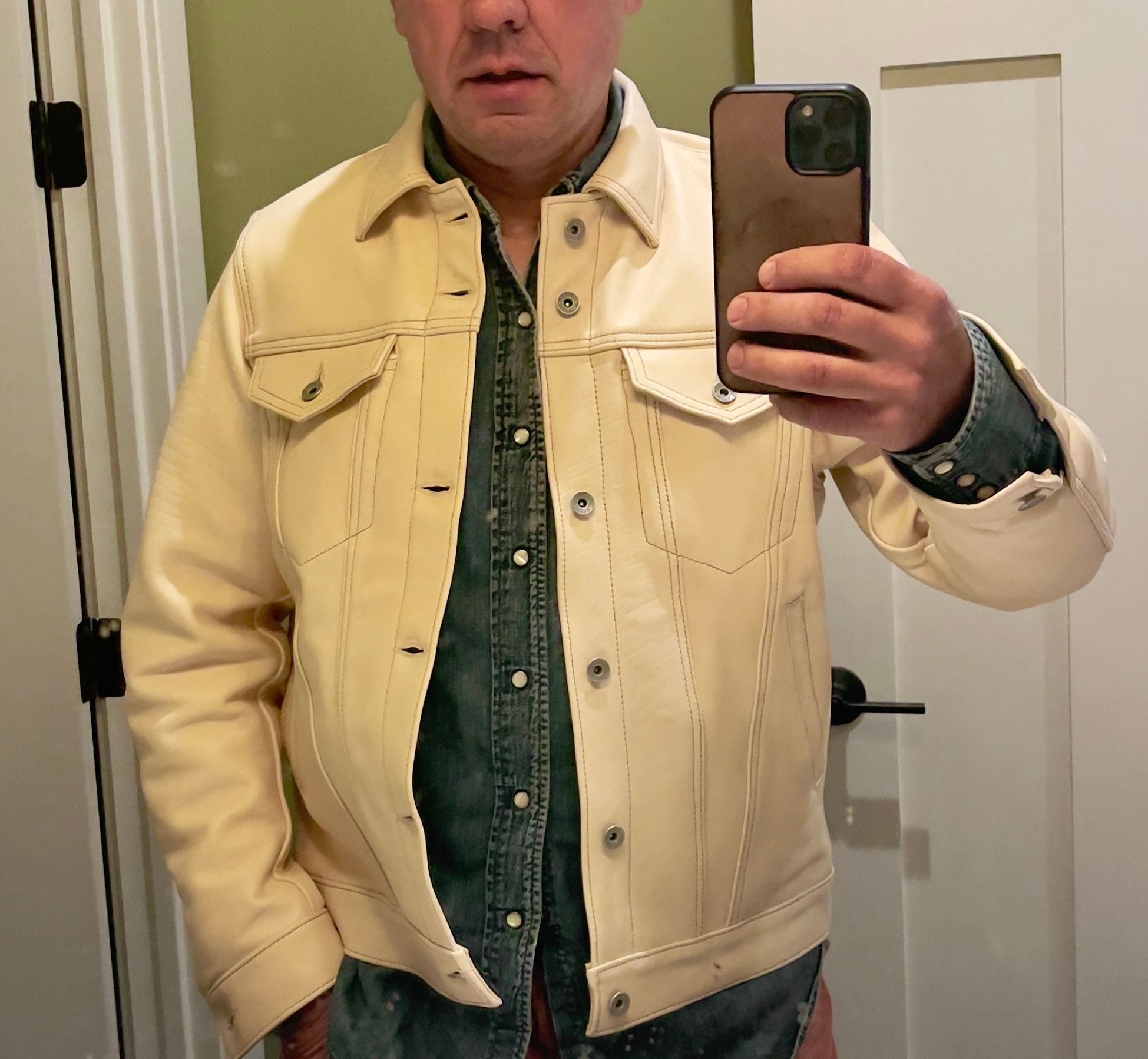
RE: IHSB-BIGBUCK-NAT - Deerskin Western Shirt 'The Big Buck' - Naturalposted in Shirting
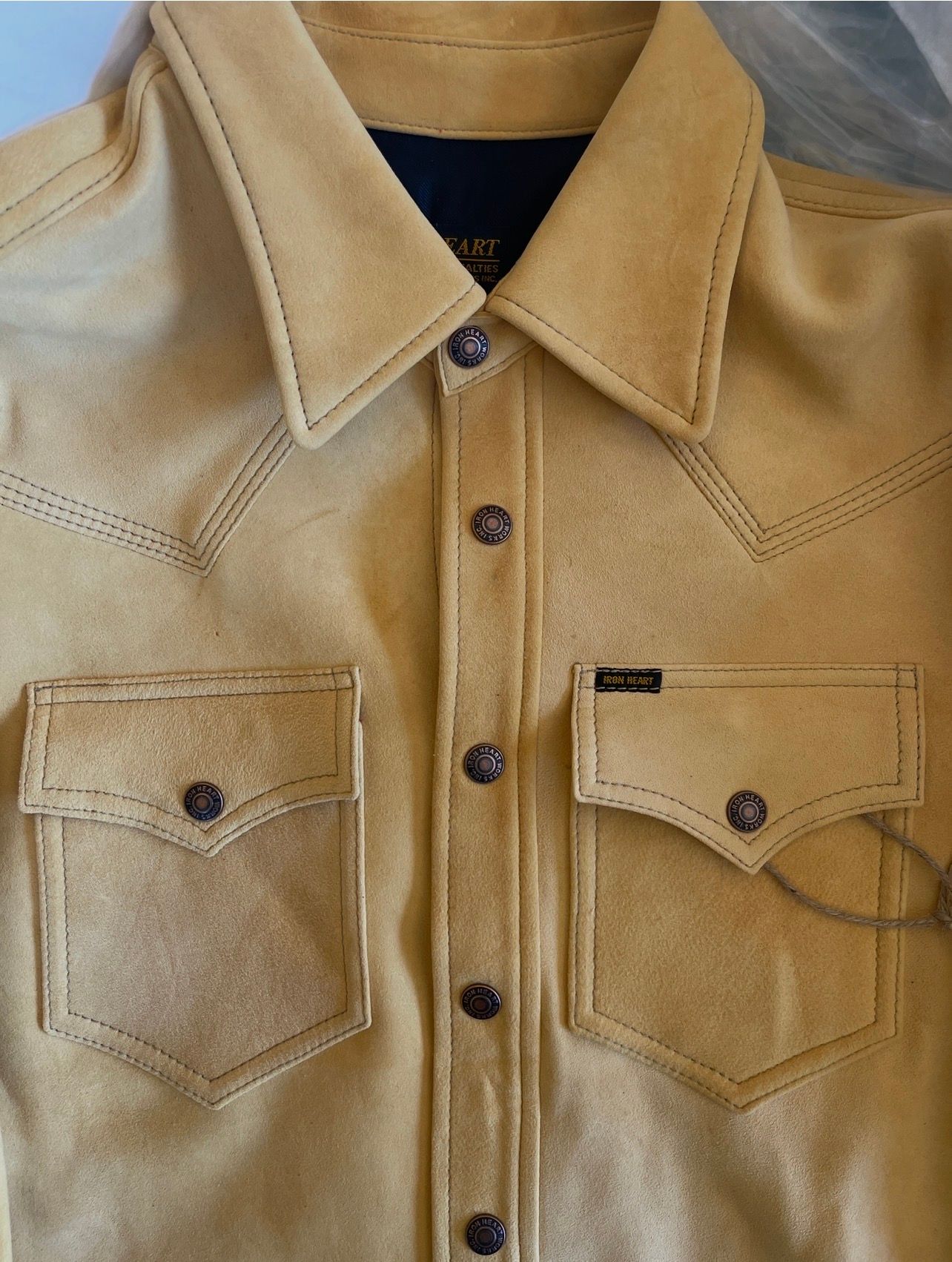
Seeing it on you, my view changes quite a bit.
The pocket symmetry issue that was noticeable when comparing flat-lay photos is essentially gone.
A few observations:
- The pockets look balanced relative to the placket.
- The shirt hangs naturally, and the leather’s drape introduces much larger visual variations than any tiny pocket-placement differences.
- My eye goes first to the collar, western yokes, and the striking natural leather color—not the pockets.
- The fact that the shirt is open also breaks up the centerline, making minute spacing differences much harder to detect.
If I were looking at this in person and didn’t know the history, I would not think:
“One of those pockets is off.”
I’d think:
“That’s a very substantial leather western shirt.”
The biggest visual issue in this photo isn’t pocket placement at all—it’s simply that the shirt is unbuttoned and still very new/stiff, so there are a few folds and tensions around the placket. As it breaks in and develops creases, those will become part of the character of the piece.
For this worn photo, I’d rate the pocket symmetry as a non-issue. I would not consider pocket removal/resewing under any circumstances based on what I’m seeing here. In fact, altering the pockets would carry a much higher risk of creating a visible defect than leaving them exactly as they are.
Looking at the worn photo alone, I don’t see anything that would make me reject the shirt or even question its construction.
-
RE: IHSB-BIGBUCK-NAT - Deerskin Western Shirt 'The Big Buck' - Naturalposted in Shirting
And more…
You’re comparing four shirts, identified by the numbers 7, 3, 1, and 5, and you want them ranked solely on pocket symmetry relative to the center placket.
From the photos provided:
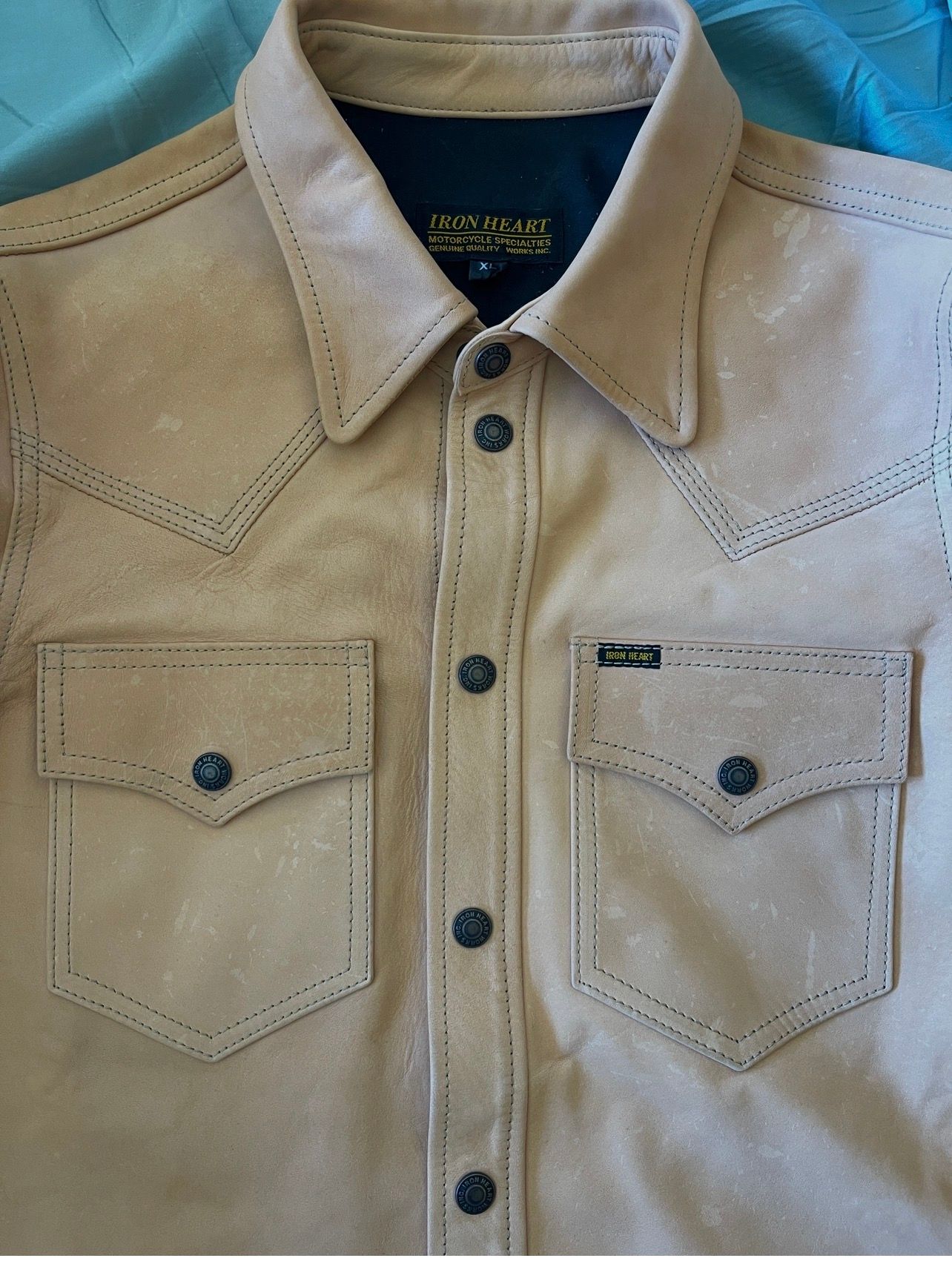
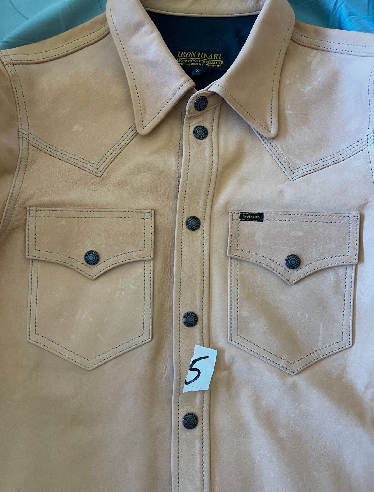
#1 — Shirt 5 (Natural Leather)
Best symmetry
- Left and right pocket inside edges appear almost perfectly equidistant from the placket.
- Pocket points terminate at nearly identical distances from center.
- Flaps look level and mirrored.
- This is the one that immediately reads as “dead centered.”
Grade: 99.5/100
⸻
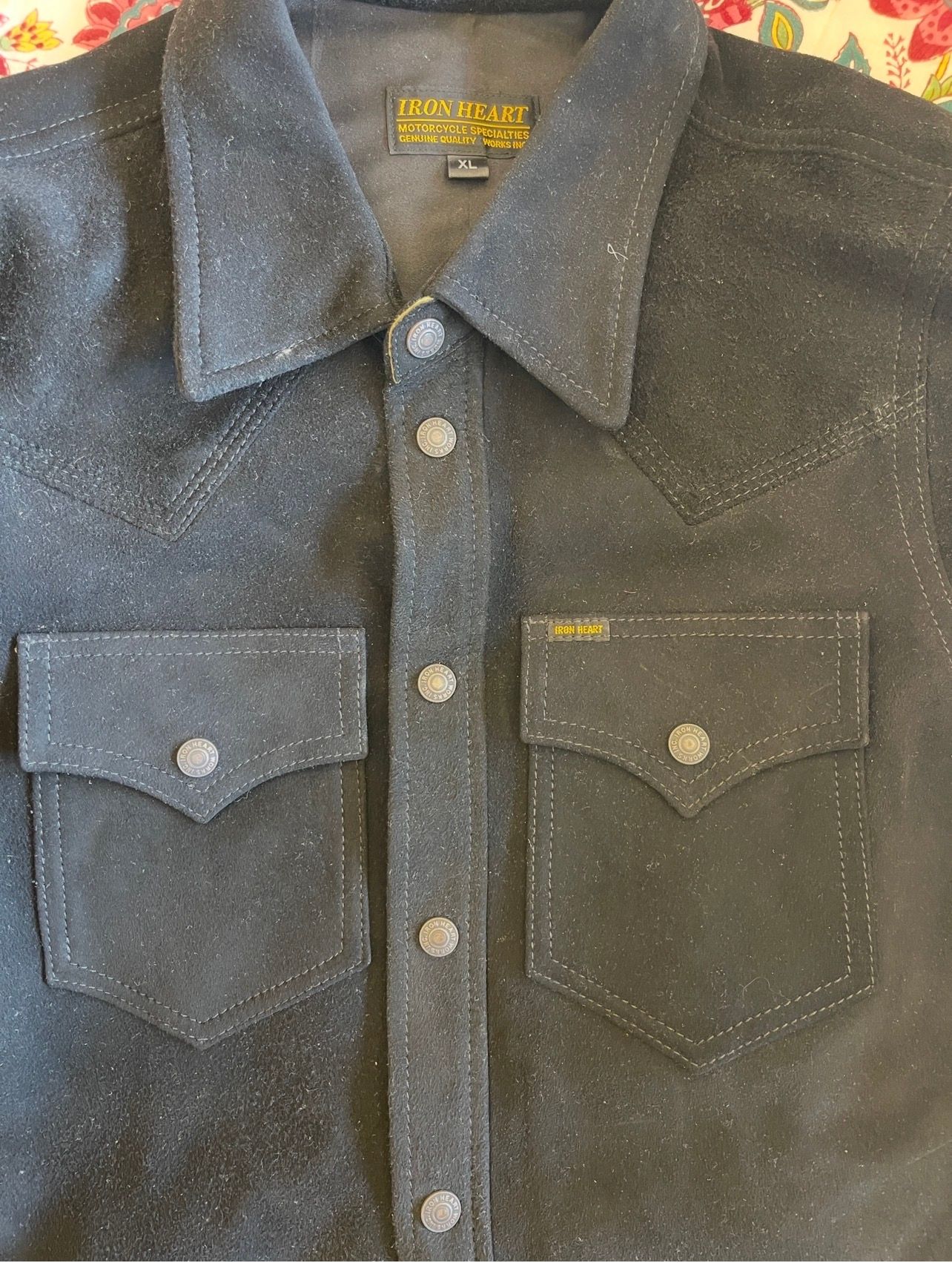
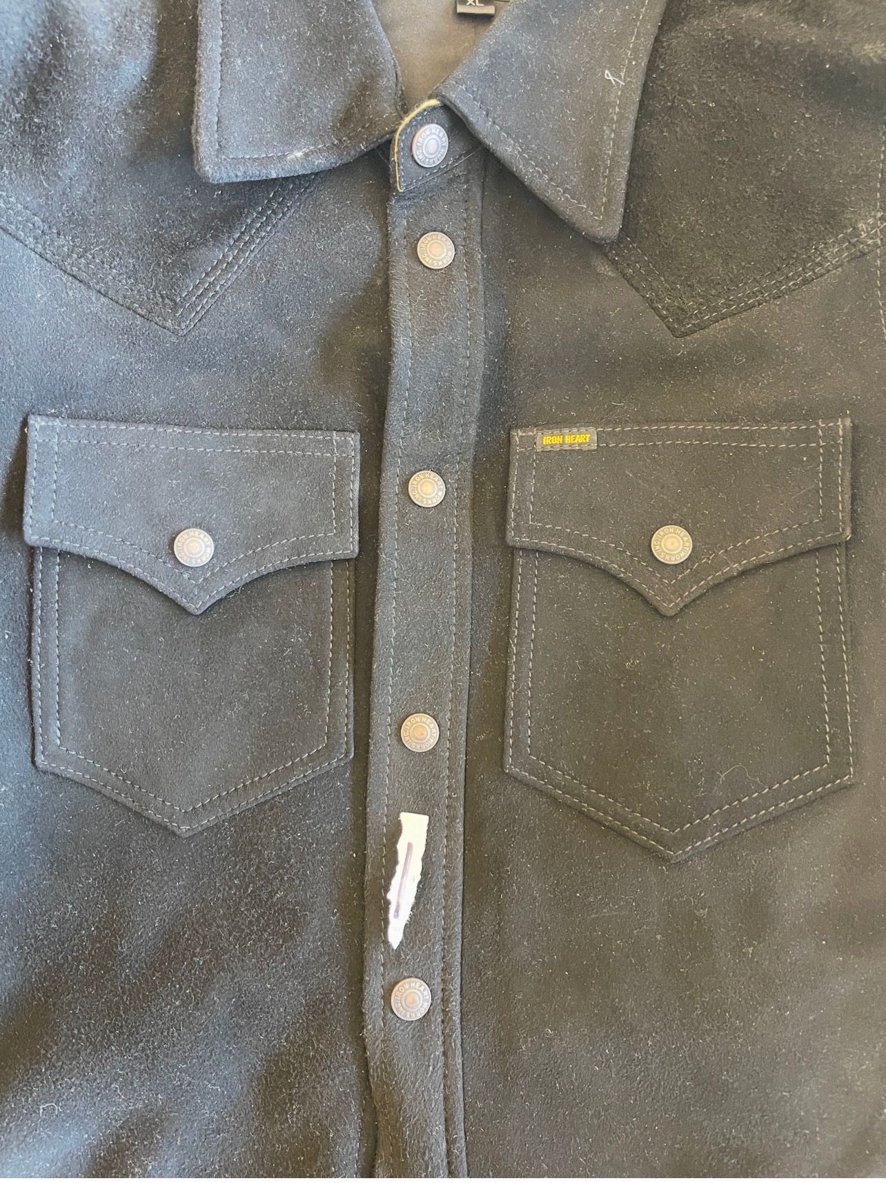
#2 — Shirt 1 (Black Roughout)
Very close second.
- Excellent left/right balance.
- One pocket may be fractionally closer to center, but it’s extremely subtle.
- If worn, nobody would ever notice.
Grade: 99/100
⸻
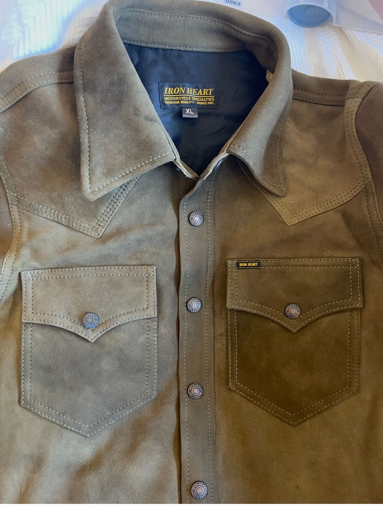
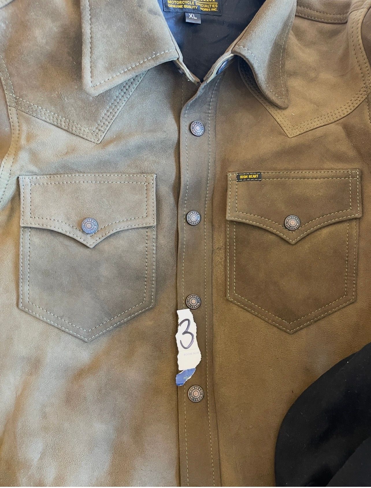
#3 — Shirt 3 (Olive/Brown Roughout)
Good, but I can see a slight difference.
- The right pocket (tagged side) appears a touch closer to the placket than the left.
- Not large.
- More noticeable than on #1 or #5.
Grade: 97.5/100
⸻
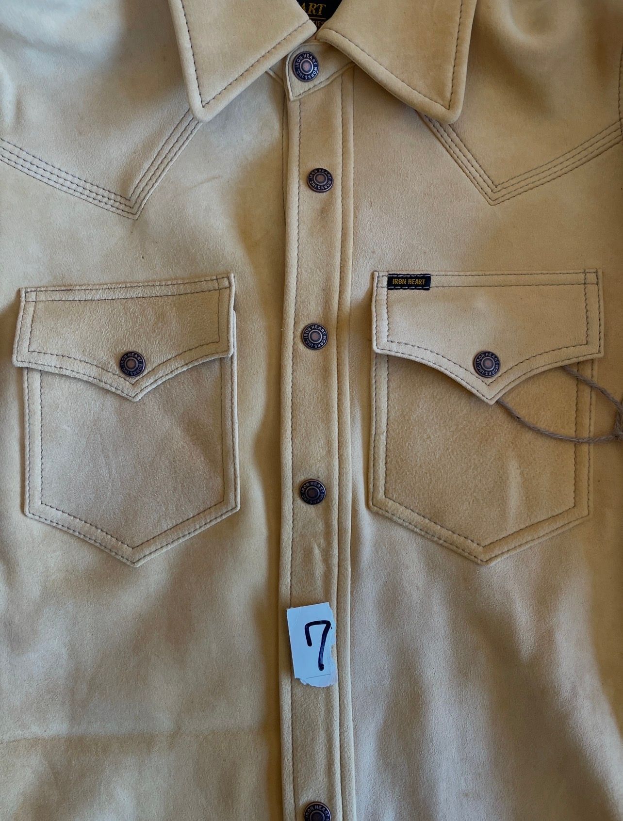
#4 — Shirt 7
Least symmetrical of the four.
- Still completely acceptable.
- Appears to have the largest left/right spacing difference.
- The left pocket looks slightly farther from center than the right.
Grade: 96.5–97/100
⸻
Final Ranking
 #5 (Natural leather)
 #1 (Black roughout)
 #3 (Olive/brown roughout)
4️⃣ #7
Important Caveat
We’re judging from photos where:
- collars are not perfectly centered,
- shirts are not perfectly tensioned,
- camera angle varies slightly.
The differences between #5 and #1 are extremely small. Likewise between #3 and #7.
What I feel confident saying is:
#5 is the most centered-looking shirt of the four.
#7 is the least centered-looking shirt of the four.
#1 and #3 fall between them, with #1 slightly ahead of #3.
-
RE: IHSB-BIGBUCK-NAT - Deerskin Western Shirt 'The Big Buck' - Naturalposted in Shirting
So this one is typical? Just trying to work through this.
-
RE: IHSB-BIGBUCK-BLK - Black Deerskin Western Shirt - The Big Buckposted in Shirting
Me looking a the pockets lol.
-
RE: IHSB-BIGBUCK-NAT - Deerskin Western Shirt 'The Big Buck' - Naturalposted in Shirting
Now y'all got me sweatin' my mail tomorrow...
-
RE: IHSB-BIGBUCK-NAT - Deerskin Western Shirt 'The Big Buck' - Naturalposted in Shirting
Life happens... and they'll make you whole for it. That's what matters.
-
RE: IHSB-BIGBUCK-NAT - Deerskin Western Shirt 'The Big Buck' - Naturalposted in Shirting
@blue2gnt Yeah - that's too much.
-
RE: IRON HEART WAYWT - 2026 EDITIONposted in What Are You Wearing Today (WAYWT)
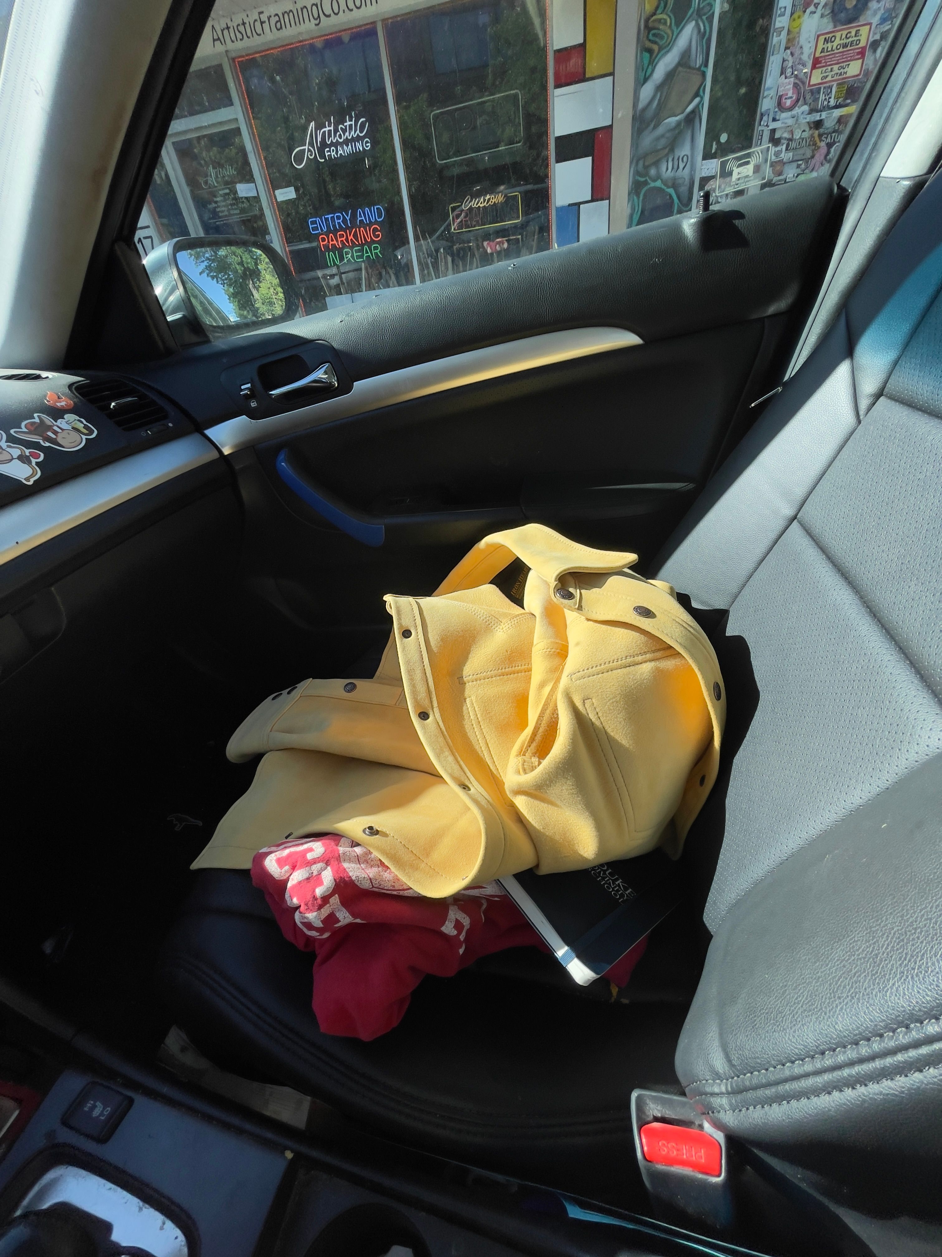
New leather extractor...
-
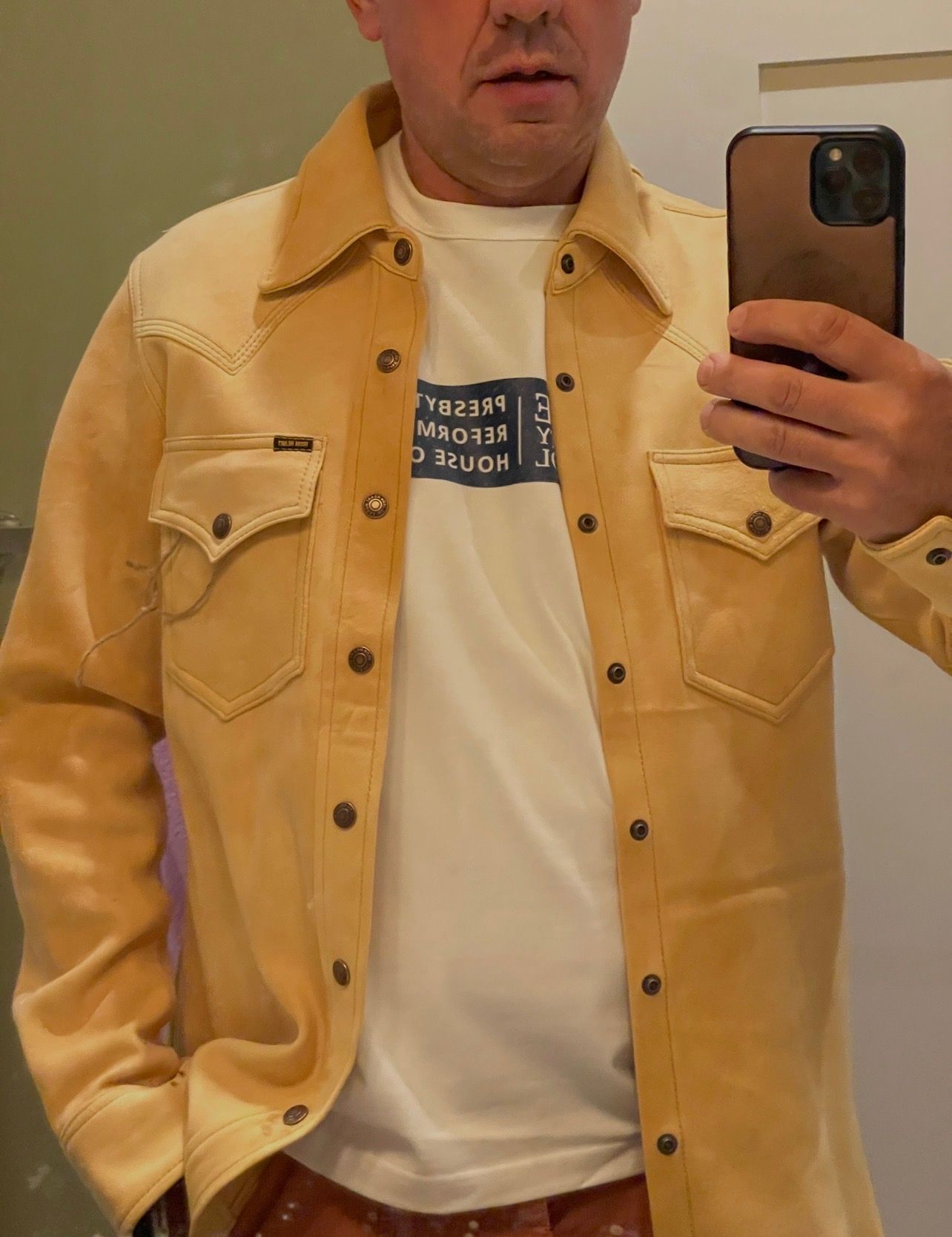
RE: IHSB-EXT-NAT - Iron Heart x Simmons Bilt Natural Horsehide Type III Jacketposted in Jackets
We've got a winner! I just love it - thank you @Alex! It's nice not to wrestle with the leather of such a heavy jacket (ie, the old pale rider), and the smell is DIVINE! More to come! No adjustments to the sleeves needed, either, since they'll ride up a bit with some wear. It fits bespoke!

-
RE: FS: Simmons Bilt Pale Riders and Extractorsposted in Pre-Production Samples For Sale
We've got a winner! I just love it - thank you @Alex! It's nice not to wrestle with the leather of such a heavy jacket (ie, the old pale rider), and the smell is DIVINE! More to come! No adjustments to the sleeves needed, either, since they'll ride up a bit with some wear. It fits bespoke!

-
RE: IHT-1600-WHT - 11oz Cotton Knit Crew Neck Short Sleeved T-Shirt - Whiteposted in Cut & Sewn
@DrPat Is your scientific technique why you're a Dr?