Iron Heart UK V3 - The New Web Site
-
One thing I've noticed is when I'm on a specific product page and I click on a thumbnail pic to see the larger pic, the larger pic that pops up wants to gravitate to the lower right corner of my iPhone screen so that only part of the image is visible. When I try to zoom in and move the screen over to see the image it gets sucked back down to the corner again. Not sure what's causing this.
-
Well done, Giles.
You should call that the "elegant" solution, rather than the "simple" one, by the way. More impressive sounding.
-
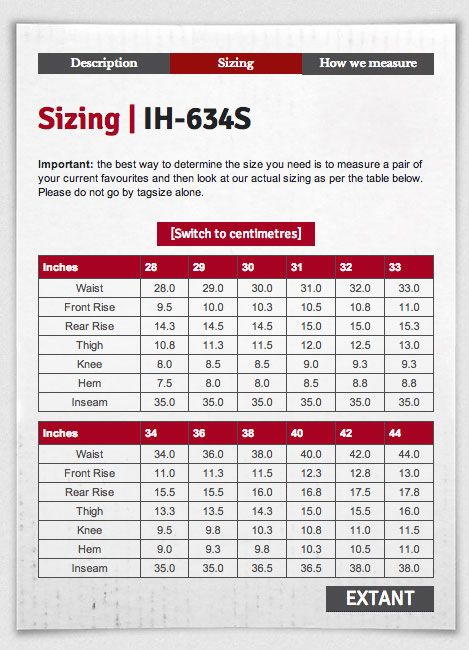
Add size 27?
-
Really splitting hairs here, and feel free to tell me to feck off or whatever….Hopefully this is not like the famous 41 shades of blue.
So when looking at the page as a whole there is a visual theme / continuity as it's being filled out. All buttons are raised, most are rounded.
When hitting payments, I see no raised buttons. I see logos of 2 companies, and YES I did hover a mouseover and realized it'd do something, but I still wasn't sure this would confirm/place my order. There's nothing inviting an end user to press a button.
The suggestions, is to continue the visual identity of making it a raised button, as well as potentially adding a tool tip along the lines of "Click here to check out", for those who do over their mouse over the button but aren't sure what it'll do.

Kindly.