Iron Heart UK V3 - The New Web Site
-
Ditto, thought my iPhone was acting crazy at first but really like it shoque
-
true that, great work shoque!
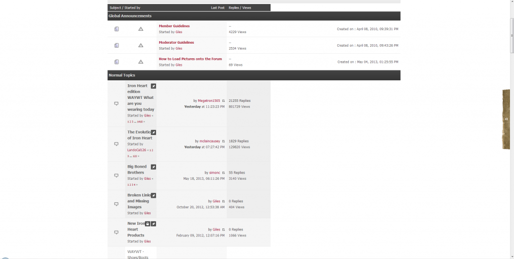
the only thing i find is that there might be a bit too much red text when checking the "unread" or "replies" for new posts etc. …maybe it would look a tad better if the "name of the thread creator" as well as "the forum section where the thread has been posted" would be black, no?
so that just the actual thread title would be red...should be a bit better for the general viewing pleasur imo!
-
true that, great work shoque!
the only thing i find is that there might be a bit too much red text when checking the "unread" or "replies" for new posts etc. …maybe it would look a tad better if the "name of the thread creator" as well as "the forum section where the thread has been posted" would be black, no?
so that just the actual thread title would be red...should be a bit better for the general viewing pleasur imo!
You are right, I will modify to look like the regular topic list.
like it a lot very clean.
Constructive criticism from a designer with over 20 years experience - the red bits in the ironheart logo don't pop/show enough from the denim background
Done, vanOlzon told me the exact same thing.

-
I'm having issues viewing the forum on my iPhone. Whenever I go back and forth thru threads my screen starts bugging out. Looks like its jumping between multiple fonts sizes. Best way I can explain it. Anyone else having this problem?
I have an Android-phone, so couldn't test on an iPhone. But I didn't change anything code-wise, only the design. Did you try restarting your iPhone already? Maybe that helps.
-
ok, can confirm the problem now, if you go back and forth for a moment.
Seems only to happen while you are in one of the boards, not in a single thread and not on the main page. Very weird, the words "Suject / Started by" are getting smaller and bigger and the whole thread overview shakes slightly. To restart the iphone did not help….

")
")